
Democratic National Committee
Brand Positioning
democrats.org
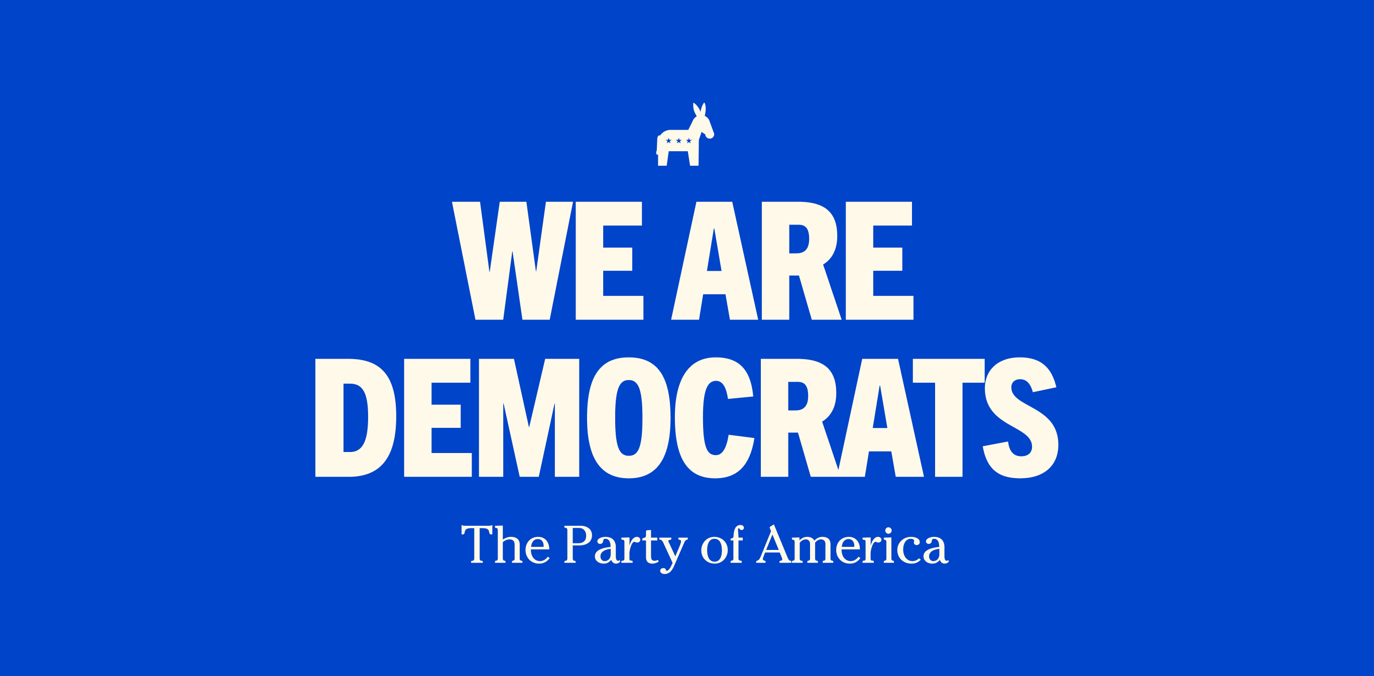
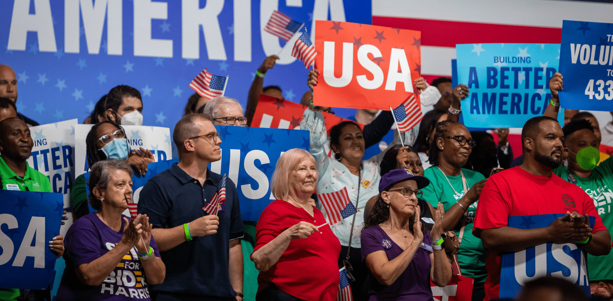
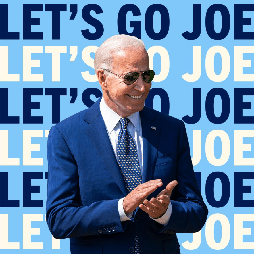
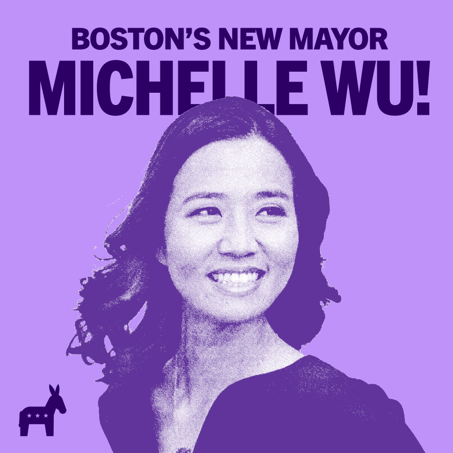
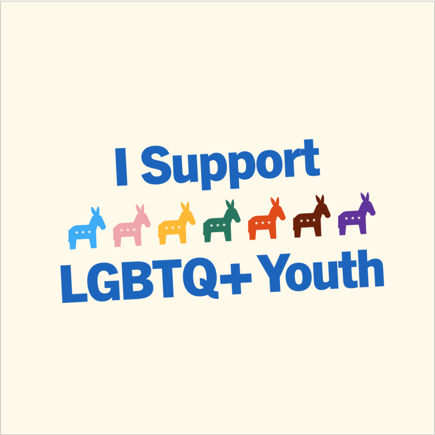
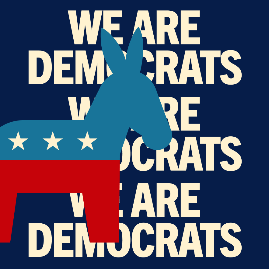
The DNC’s first major brand refresh since President Obama took office over a decade ago comes with expressive typography, lively colors, and a fresh new energy. We Are Democrats, and that’s something to be proud of.
This does a very difficult job very well, establishing a restrained and respectful identity.
Armin Vit, Brand New
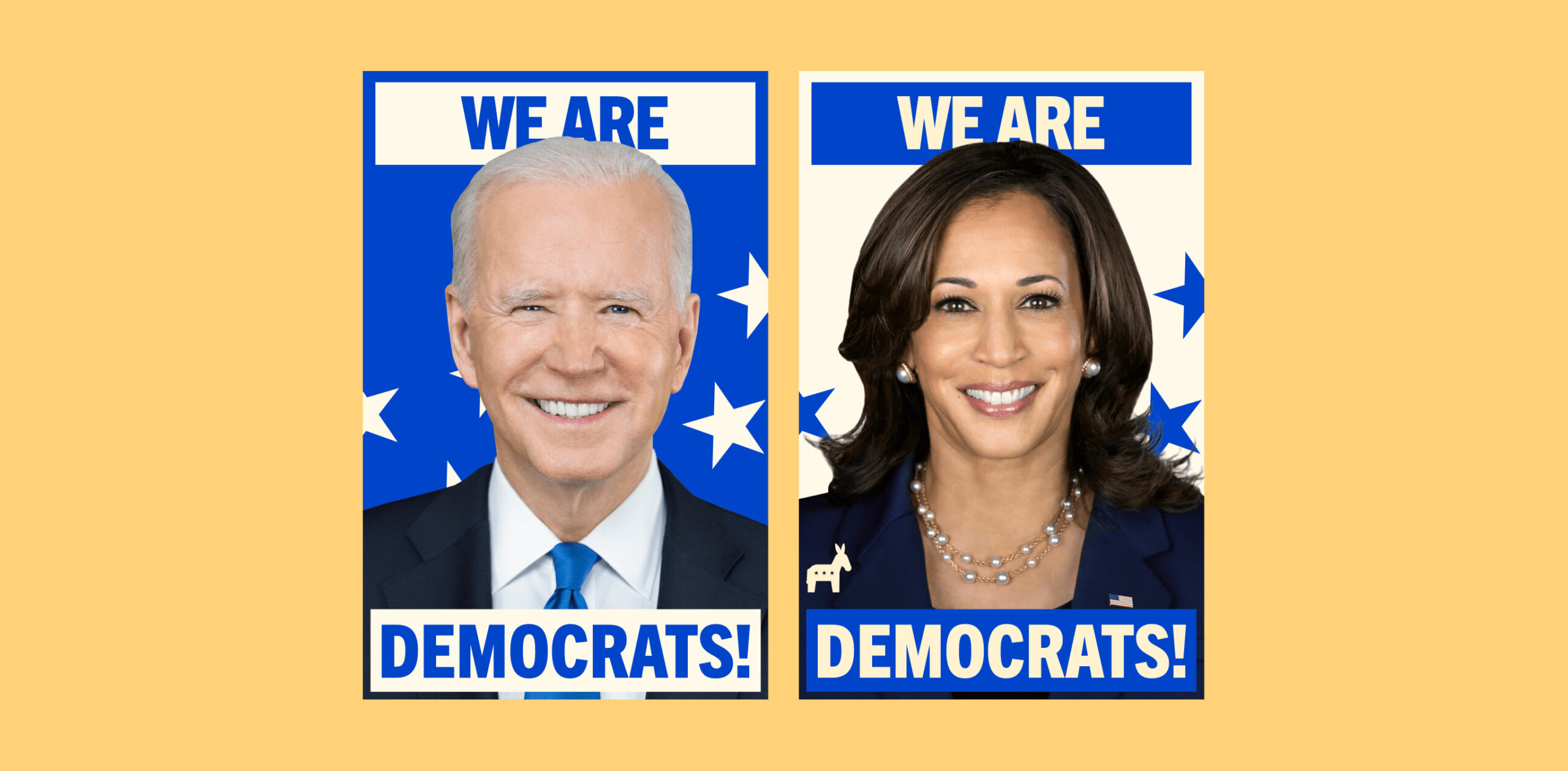
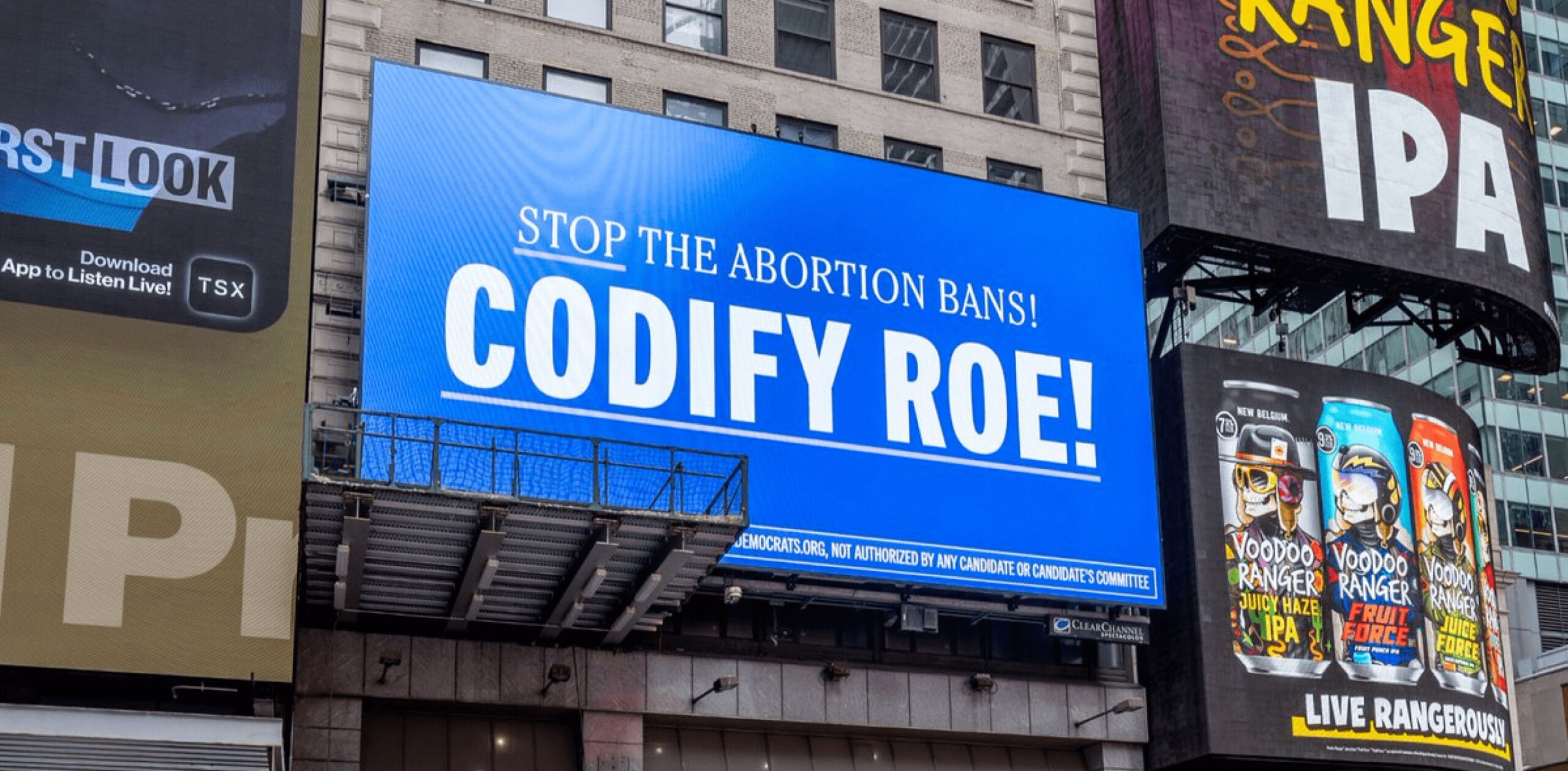
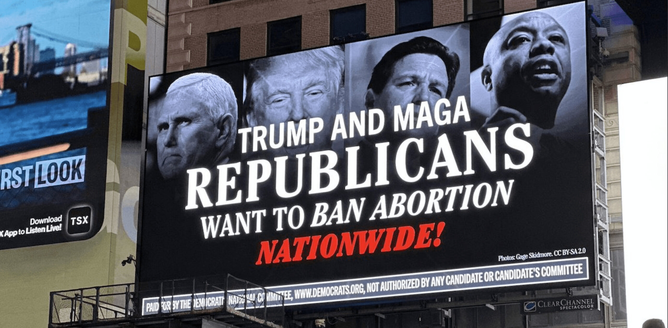
Sitting within this refresh is an updated color palette that stretches beyond red, white, and blue — introducing natural tones of yellow, green, red, and purple to reflect the exuberant energy of the party.
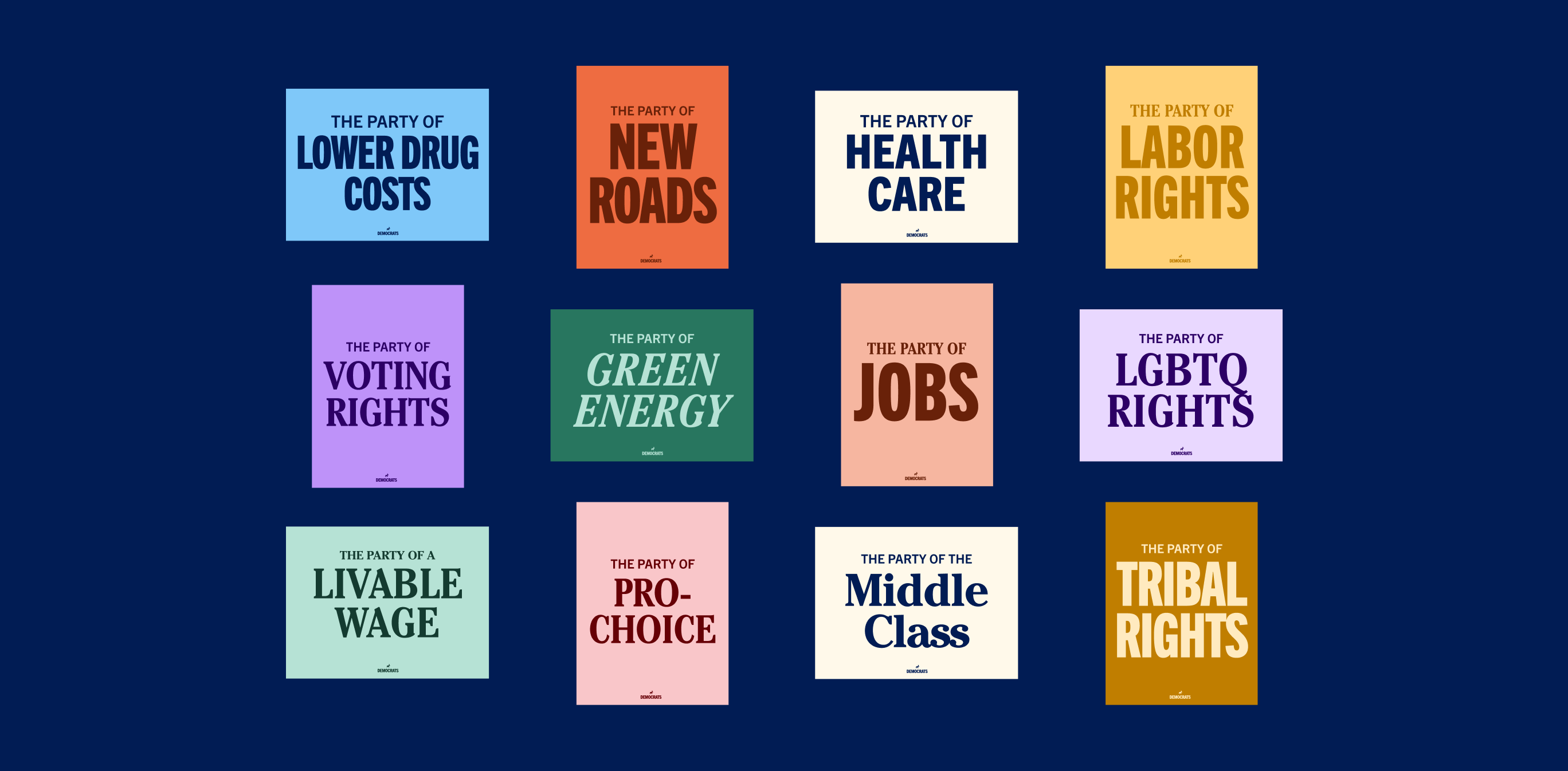
Alongside these color updates are two new typefaces: ITC Cheltenham and Trade Gothic. These fonts allow this refresh to feel both friendly and stoic, meeting the moment of our politics.
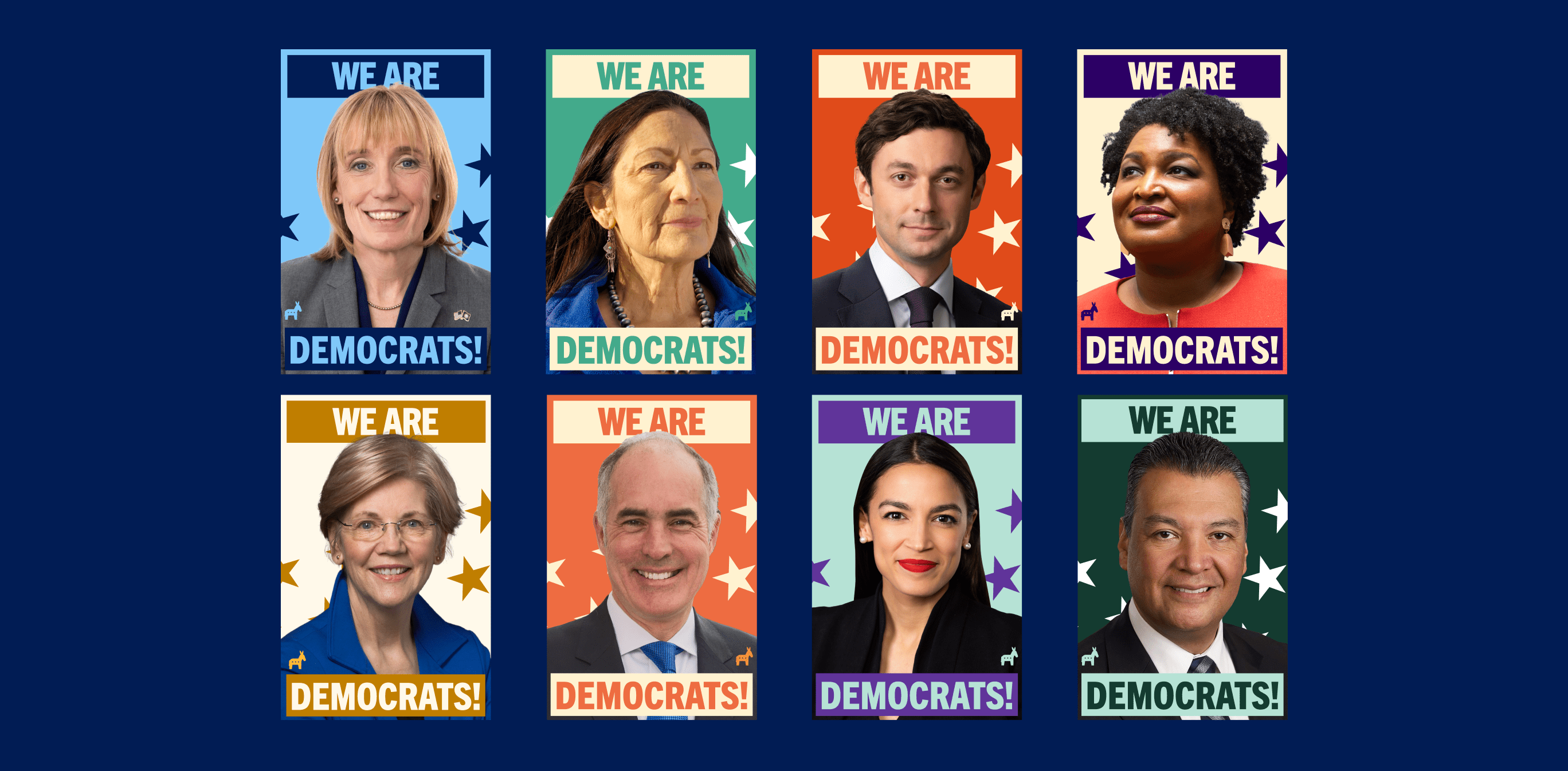


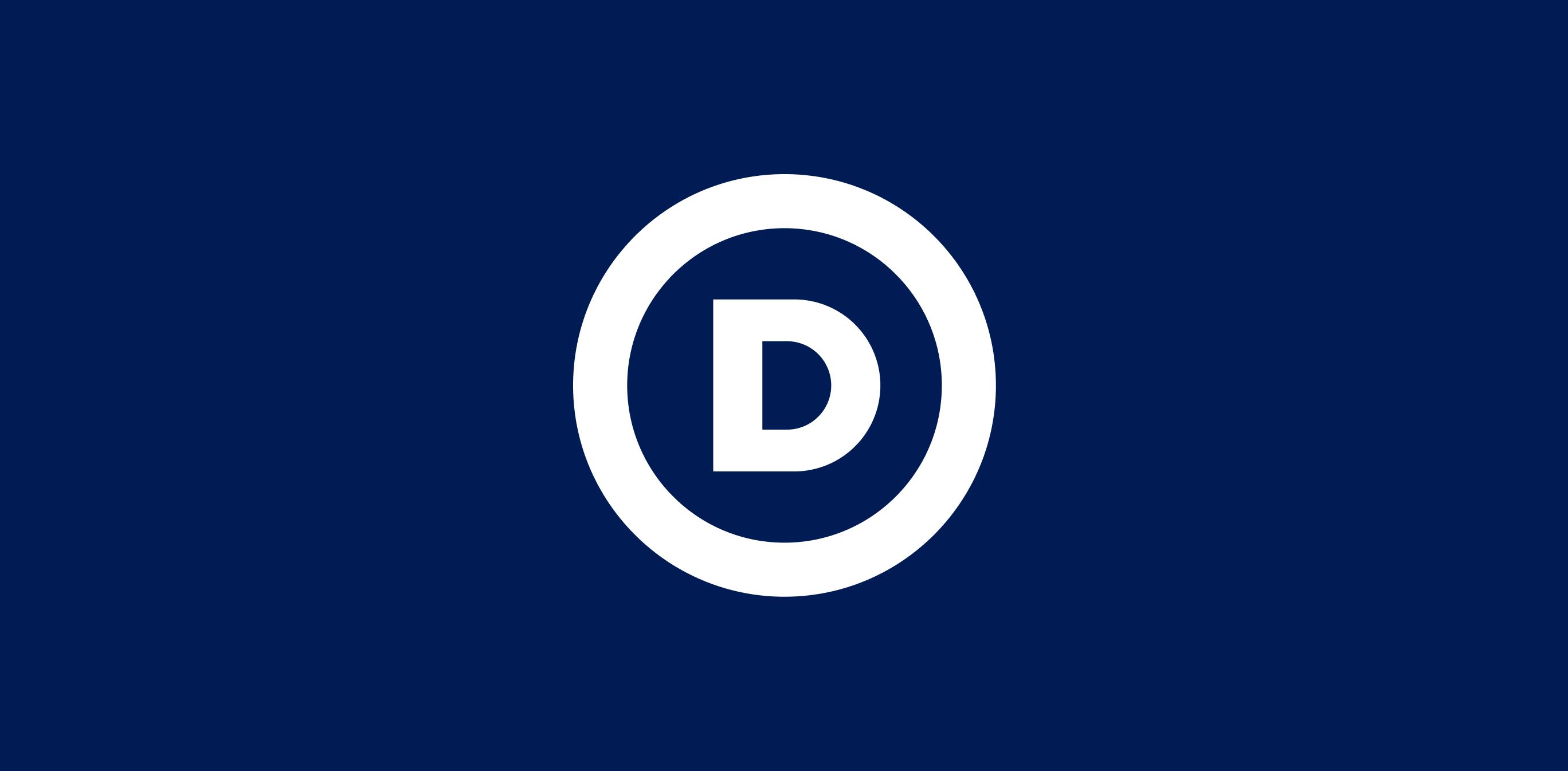
The tried and true Circle D brand of the DNC stays with us, evolving into a workhorse. It holds strong while delivering important information to the American people about the historic progress Democrats are making. The Circle D brand shares the new typography and color of The Donkey Brand to create a visual harmony between the two.


Studio Team:
Robyn Kanner,Eric Ziminsky, and
Anna Impson