Mayday Health
Brand Positioning
Creative Direction
UI/UX
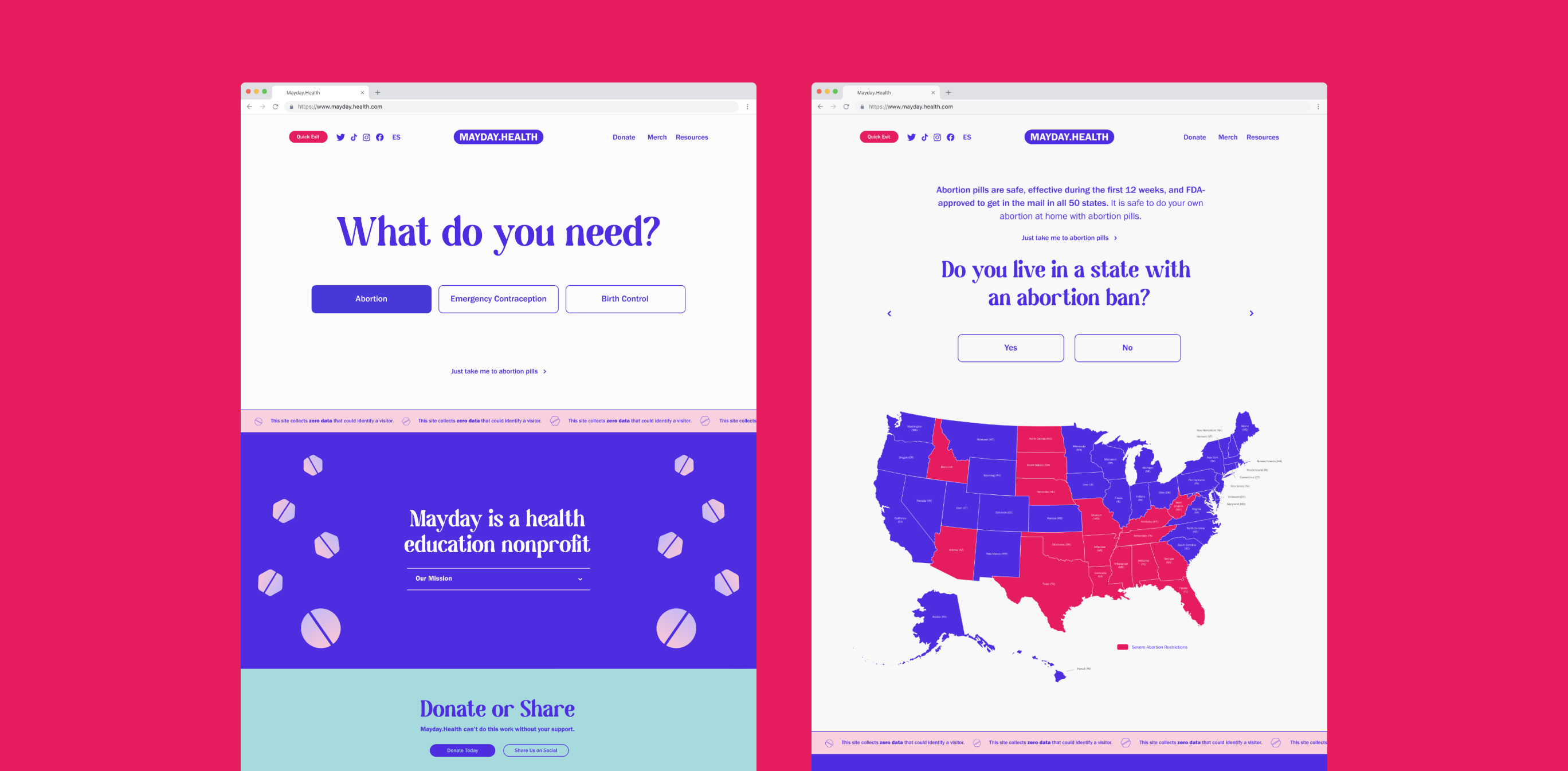
Mayday.Health
Before Roe v. Wade was officially overturned, the writing was already on the wall. We knew it was coming, and so did personal friends of Mosaic, Olivia Raisner, Sam Koppelman, and Nathaniel Horowitz, who were already preparing to fight it. When the Dobbs v. Jackson decision to overturn Roe v. Wade was leaked to the public, Sam, Nathaniel, and Olivia founded a nonprofit organization that aimed to deliver information about abortion access to all 50 states.
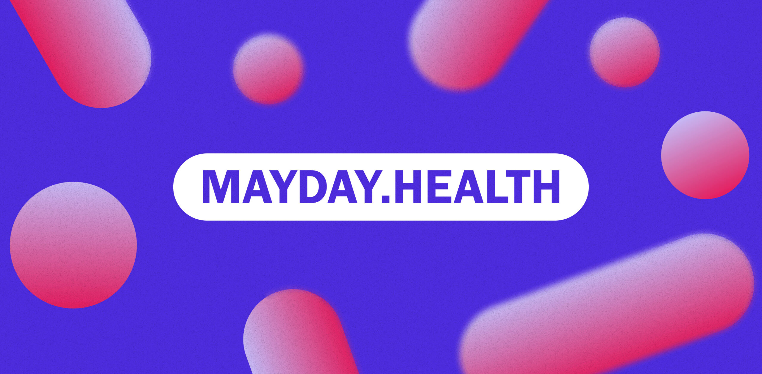
Aptly named Mayday Health, the organization’s mission is to make it as easy as possible for people across the country to learn how to get an abortion. The mission was critical and urgent, but their existing branding wasn’t, um, great. It felt too much like the other grassroots organizations doing similar work. It didn’t stand out.
So three days before the official ruling, Mosaic’s Creative Director Robyn Kanner reached out to Olivia, Sam, and Nathaniel with a loving proposition: If you let us, we can make a much more effective brand for you in 48 hours. That might seem overly ambitious, but identifying startups doing great work who need help making a big splash out of the gate is kind of our thing.
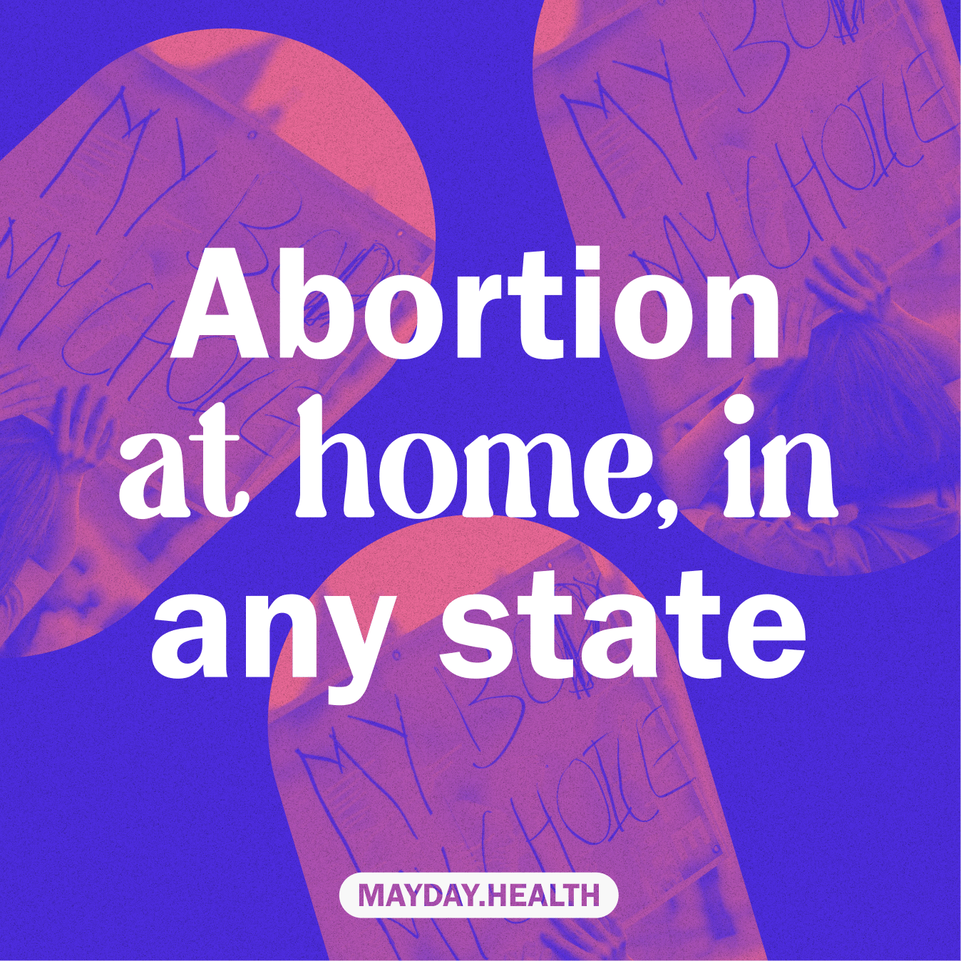
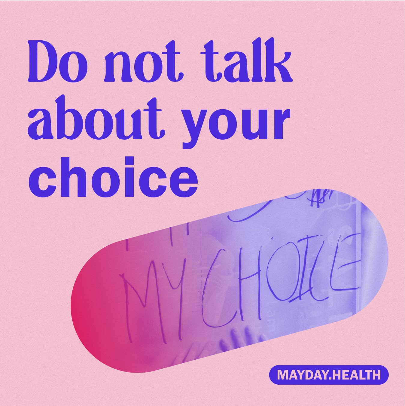
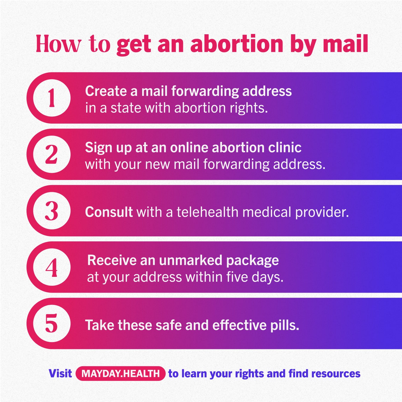
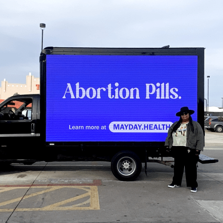
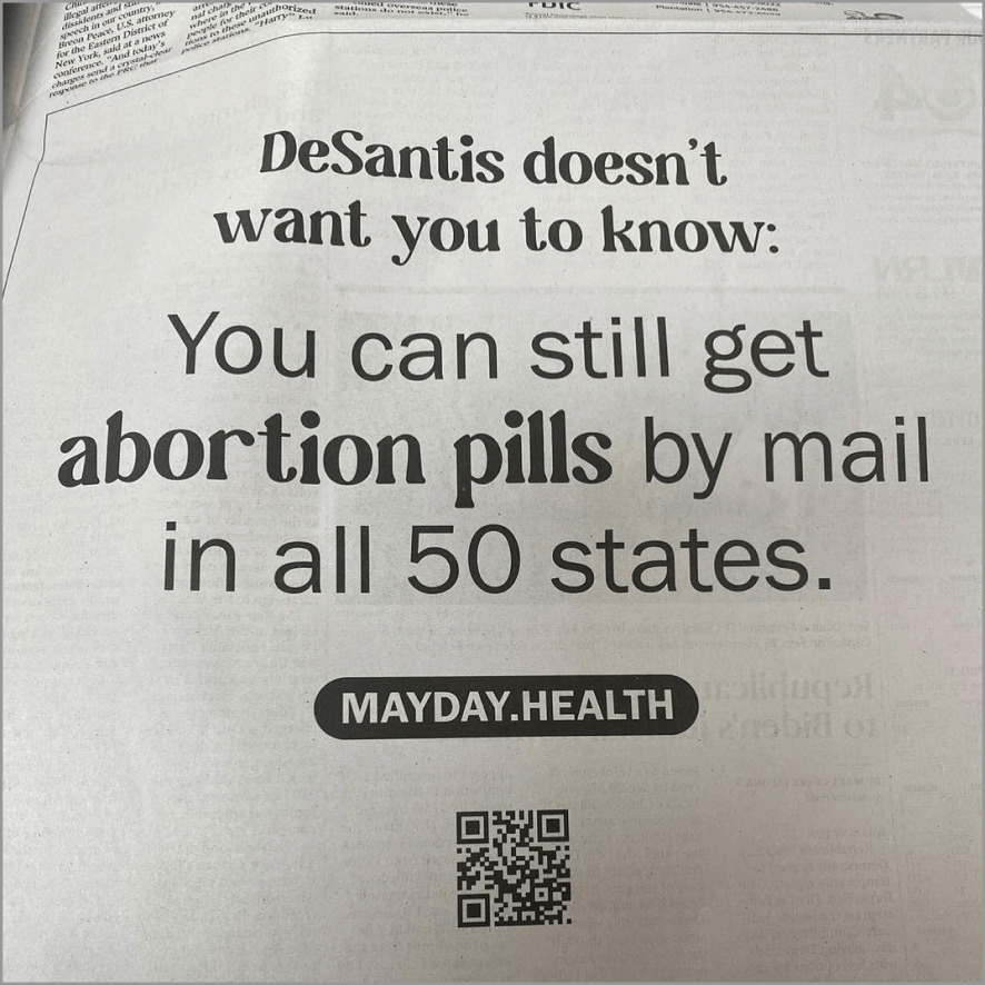
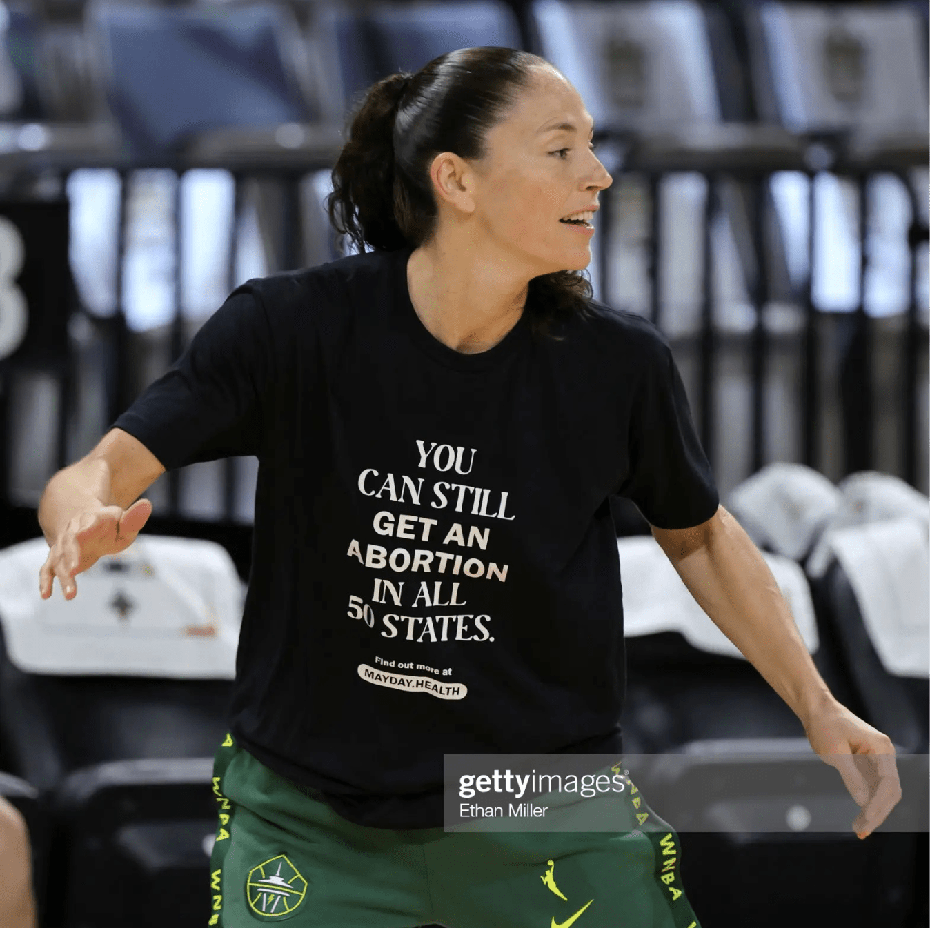
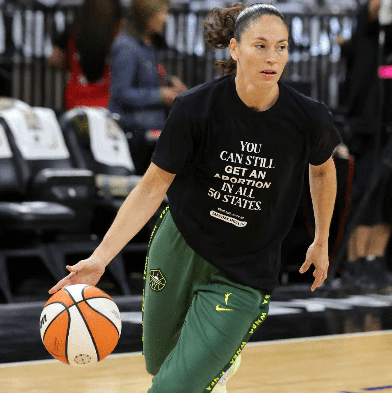
We knew the branding needed to be the perfect combination of friendly, approachable, and serious. It also needed to be LOUD to cut through the noise and connect with people in hard-to-reach places. Combining bold color contrasts, clear type, and abortion pill-inspired imagery, we designed a variety of highly impactful creative assets. So impactful that Mayday reached millions of people within 48 hours of its launch, including members of congress. In fact, on the day Roe was overturned, Mayday’s posts reached more people than Planned Parenthood’s, even though they started the day with zero followers.
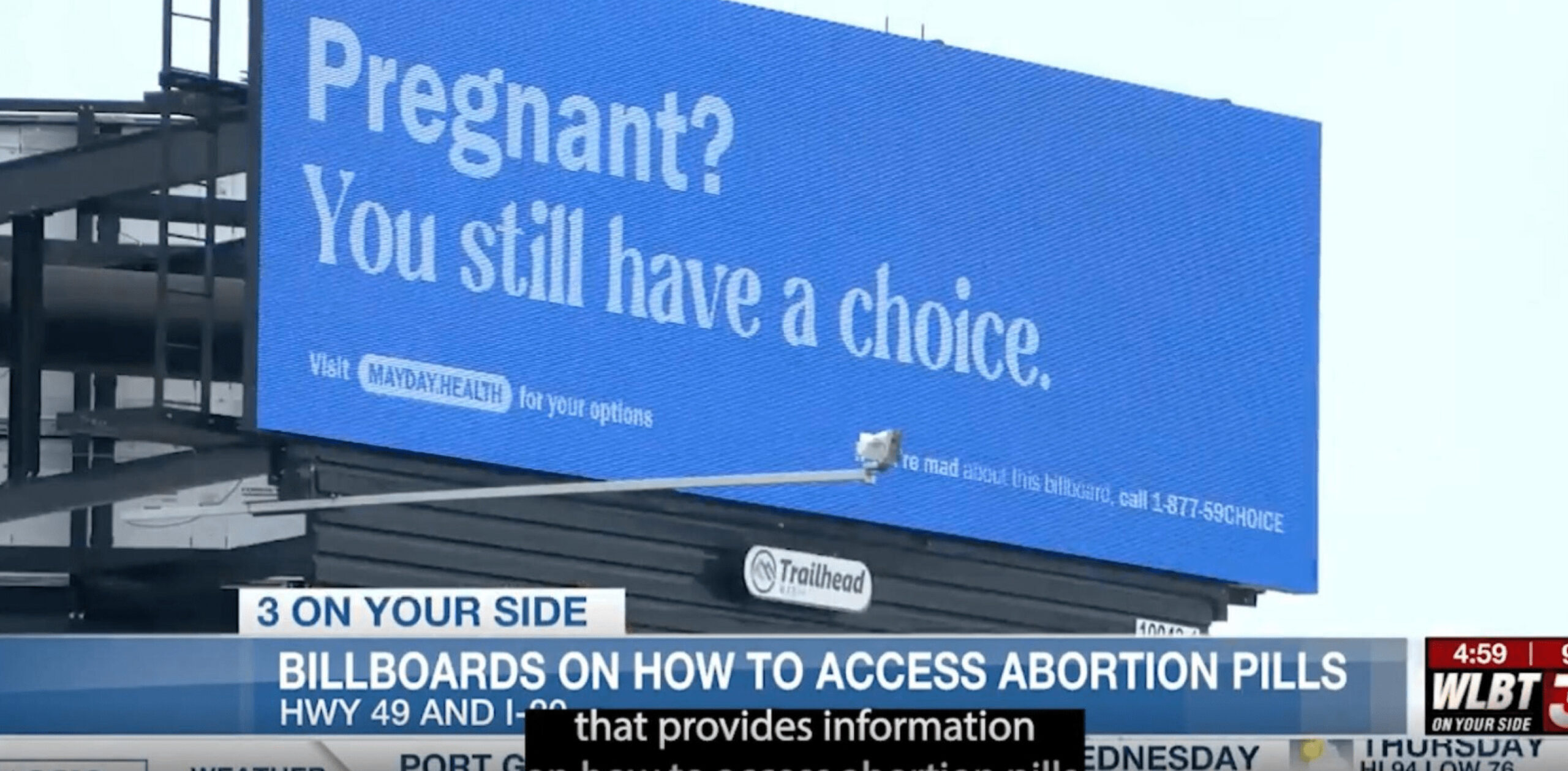
One asset we designed was a billboard that splashed across Jackson, Mississippi: “Pregnant? You still have a choice.” Well, the state of Mississippi was pissed about that, so they subpoenaed Mayday. But it was a BS subpoena — baseless and unenforceable. So Mayday decided instead of taking down billboards, they’d put up 20 new ones. We designed all of them.
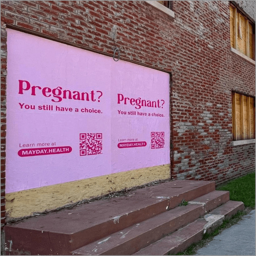
In addition to billboards, television ads, and social media content, Mayday wanted our help with opening a storefront in Bastrop, Texas. Turns out, you can’t just put a sign on your store; you have to do it within legal constraints that dictate how much of the windows you’re allowed to cover. So we did some math and created bold signs within these limitations to show Bastrop residents where to get abortion help.
All told, the campaign made an enormous cultural impact, with the first social media post generating over 100,000 likes on a new account, along with profiles in publications like Time. It was the sort of campaign that let us do what we do best: identify a cultural opportunity on the horizon and quickly leverage it to make a massive impact.
Studio Team:
Robyn Kanner, Deanna Marie-Norcross,
Eric Ziminsky,
Anna Impson, and Rae Roberts

