Biden for America
Brand Positioning
Creative Direction
UI/UX
joebiden.org
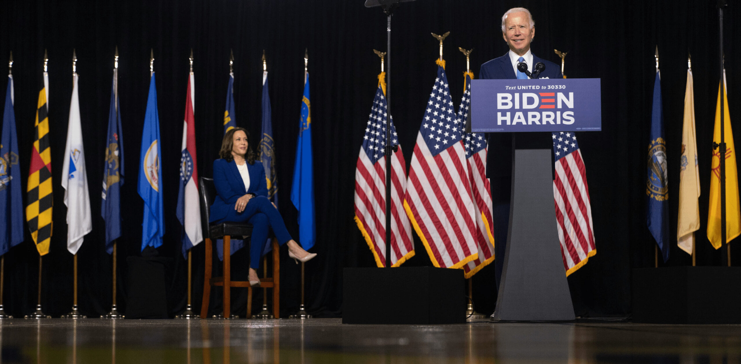
After winning the primary in South Carolina, Joe Biden’s team reached out to our Creative Director Robyn Kanner after seeing her work on Beto O’Rourke’s presidential campaign. The Biden team wanted us to lead the efforts on a brand refresh and set the tone for the historic 2020 general election.
We worked on this campaign at the start of the pandemic, which took everyone out of the office and put us fully online indefinitely. But not even a pandemic could stop us from forming a powerhouse creative team of 25 designers that helped transform Joe Biden into a multi-dimensional candidate who reflects the ever-evolving diversity of the country.
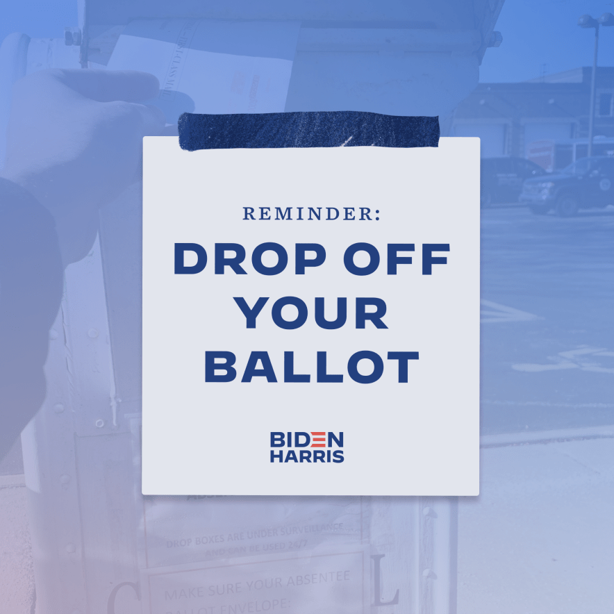
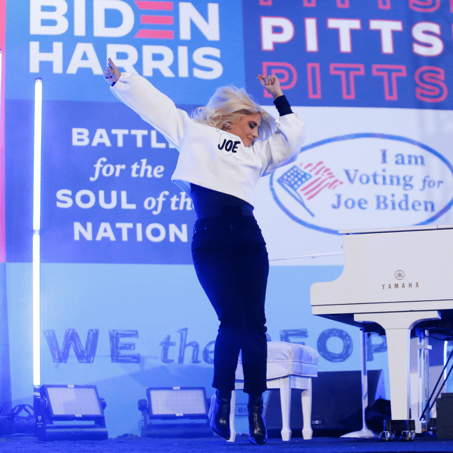
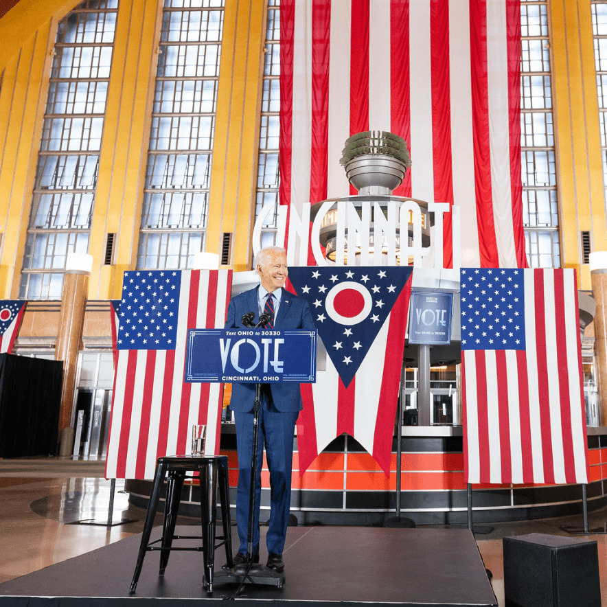
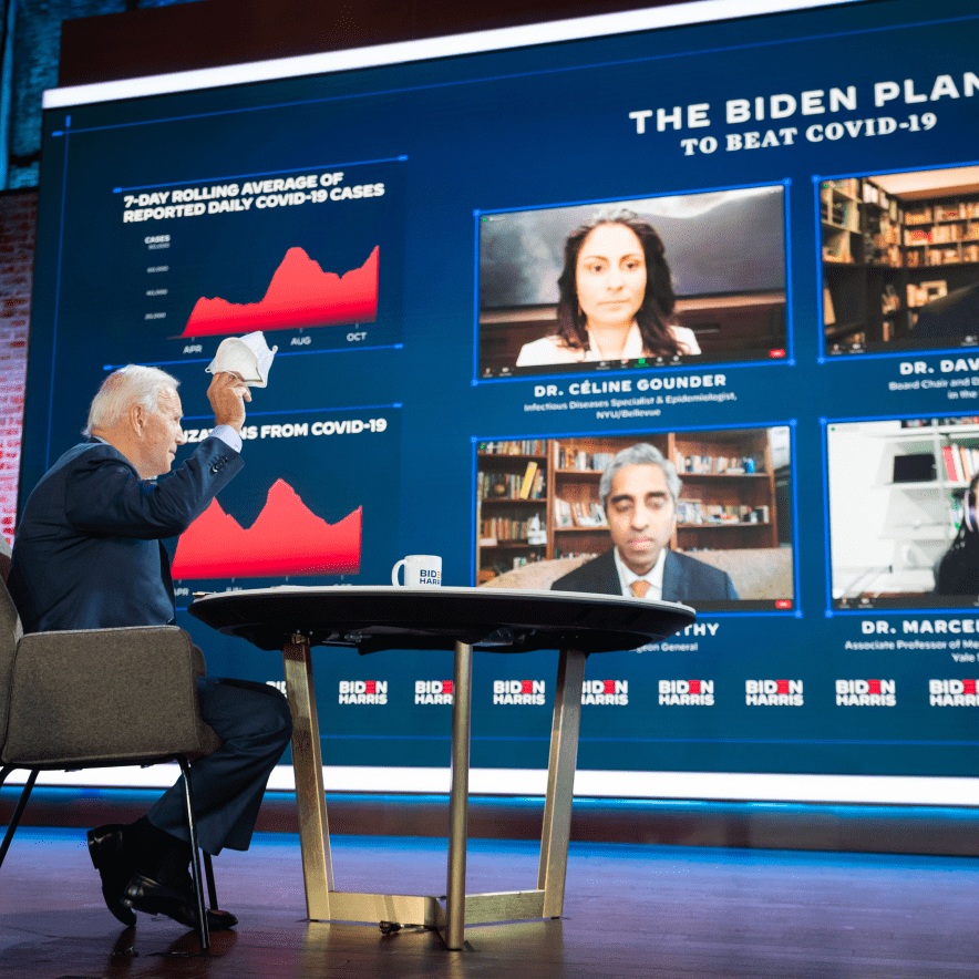
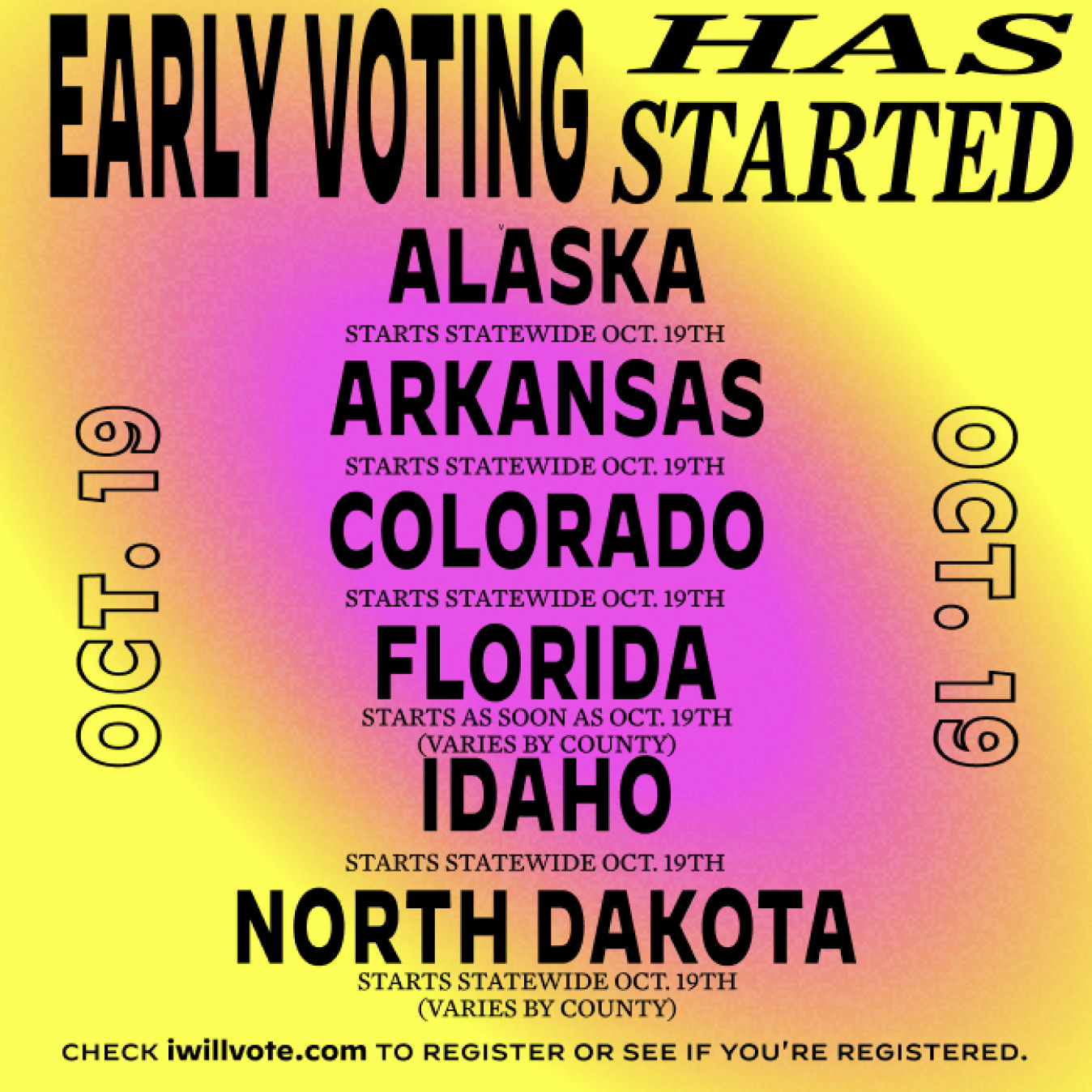
The pandemic forced Biden’s travel schedule to an abrupt halt, which meant many critical campaign events needed to happen online rather than in person. As we all know by now, infusing energy into a virtual event is no easy feat, so we put our collective heads together to design eye-catching visual assets made specifically for produced recordings, Zoom meetings, and livestream events on diverse platforms, including Facebook, YouTube, and Twitch.
The Biden visual identity was a powerful antidote to the Trump brand.
– Lilly Smith, Fast Company
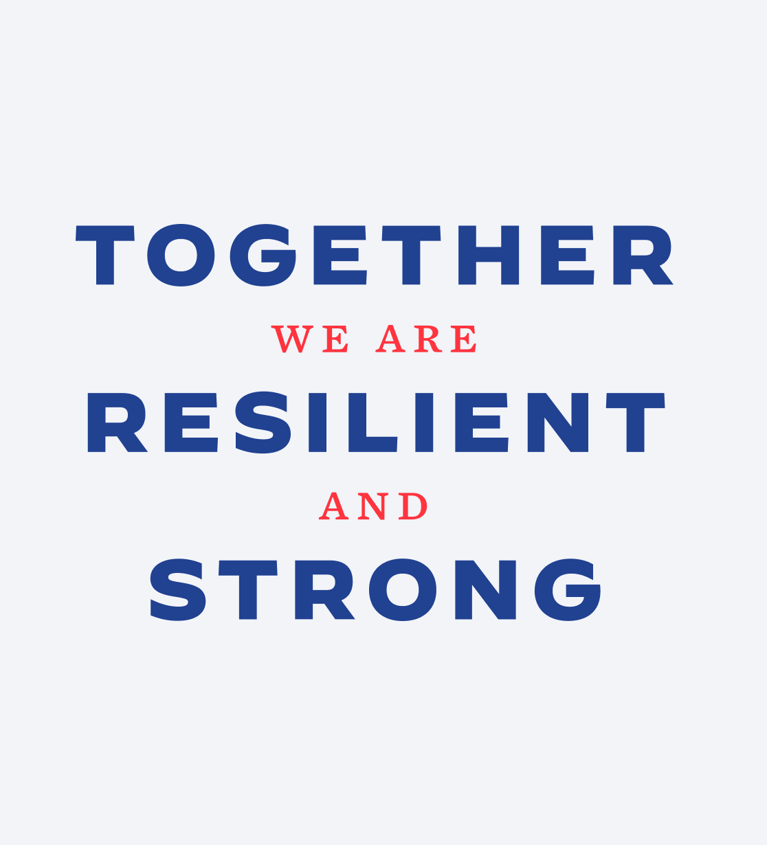
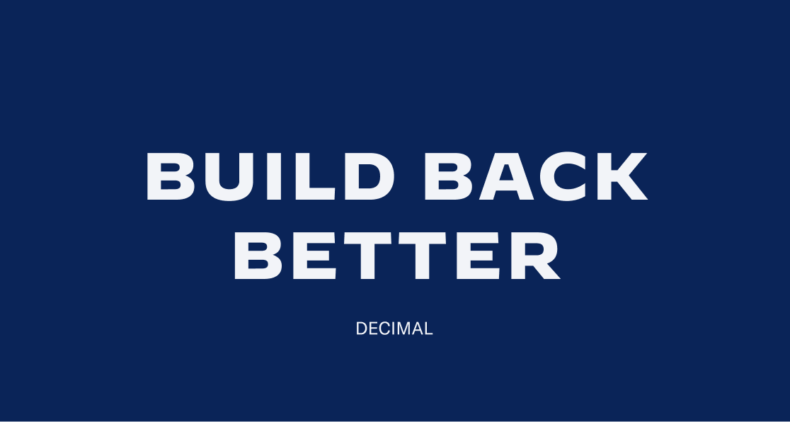
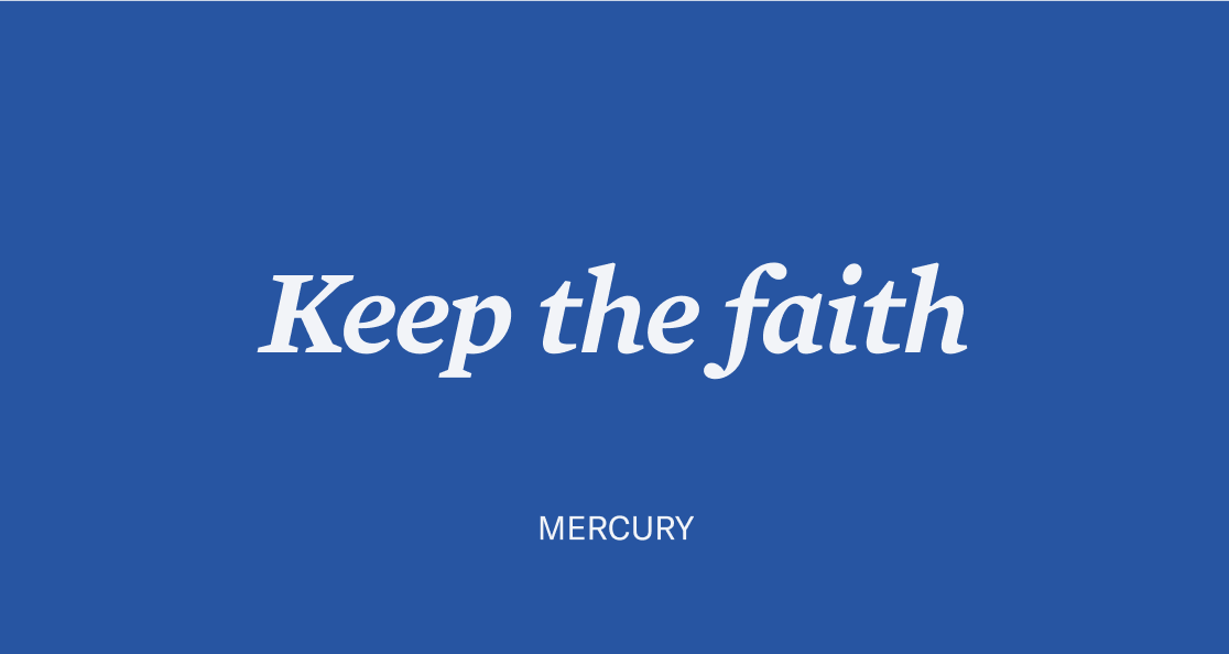
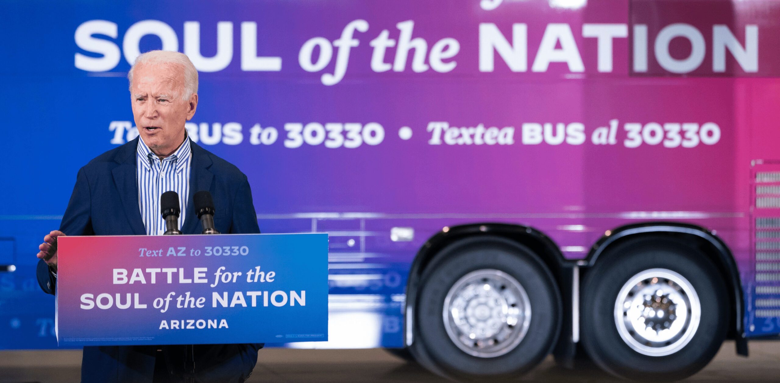
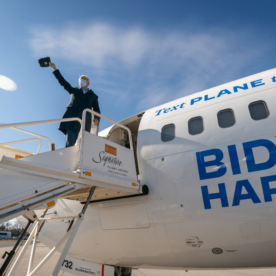
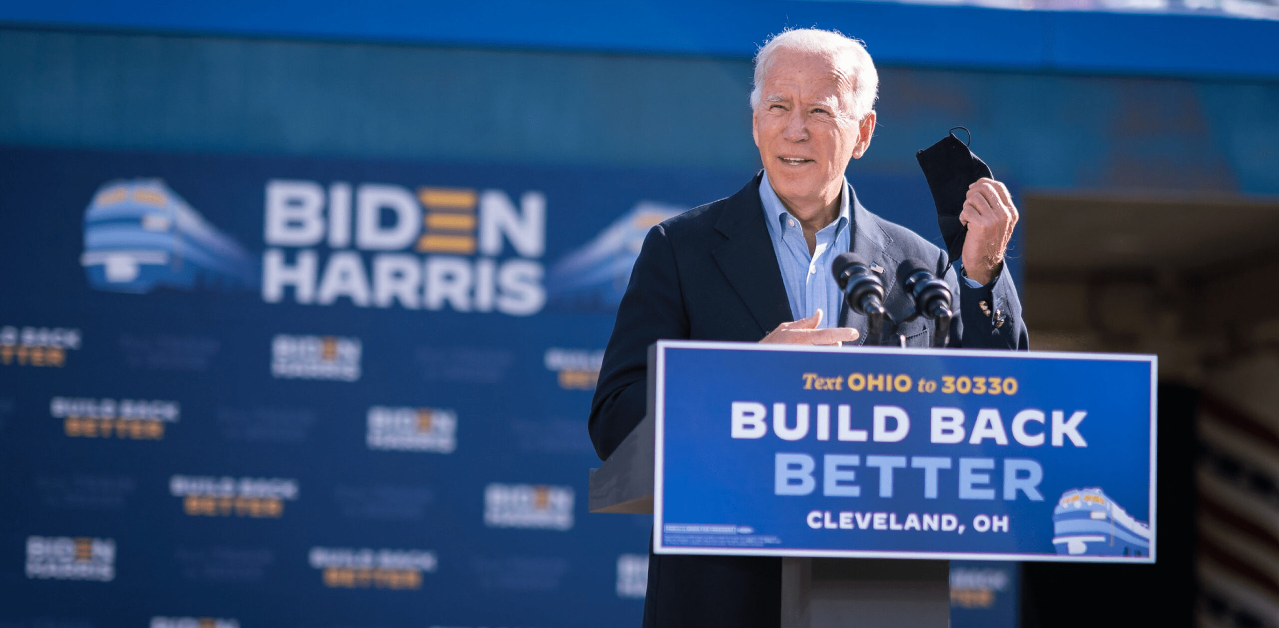
But even despite widespread travel restrictions, Biden still needed to hit the road toward the end of the campaign, so we also designed a merch truck in Pennsylvania, the official VIP 747 jumbo jet, a tour bus, and over two-dozen branded assets for a train tour, including maps, wraps, steps and repeats, and tickets.
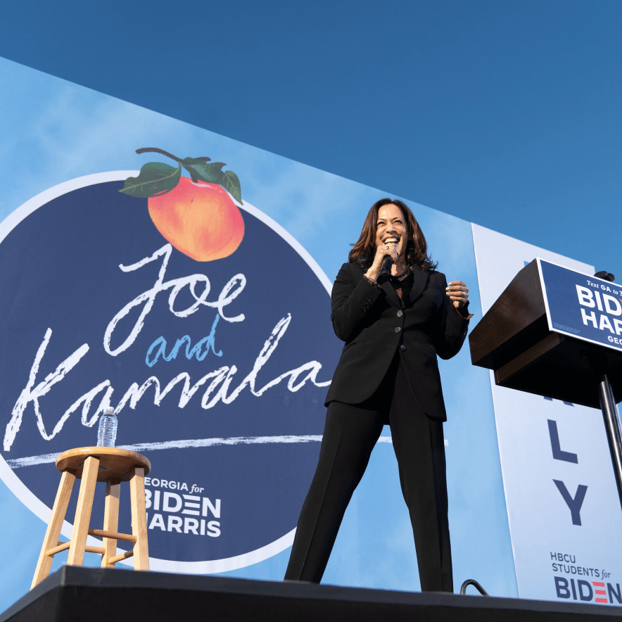
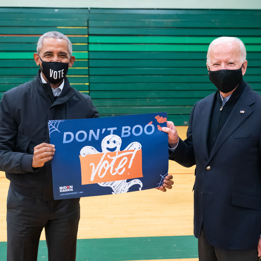
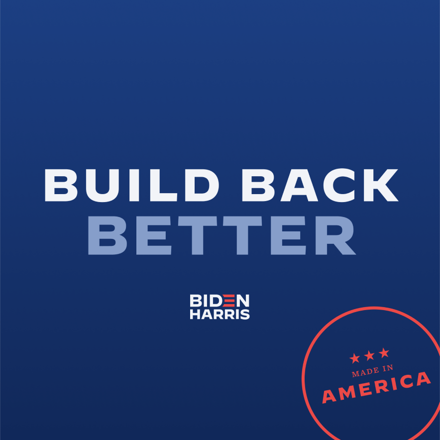
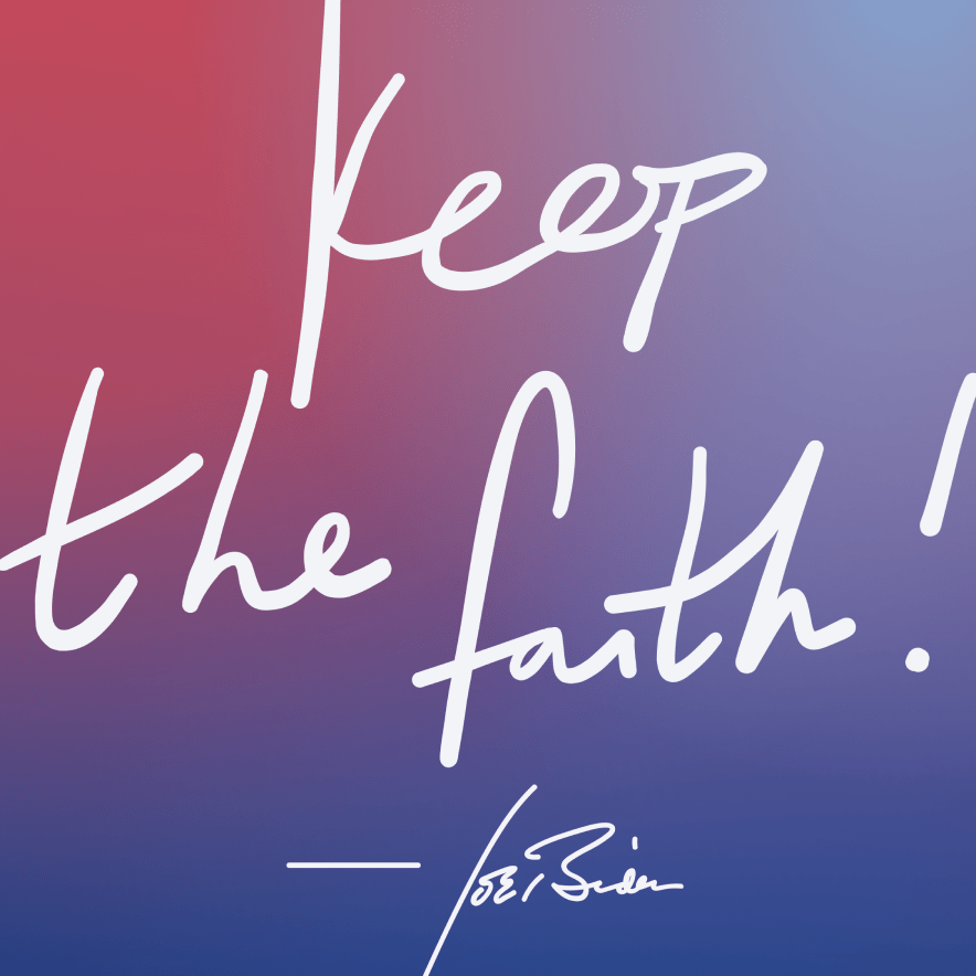
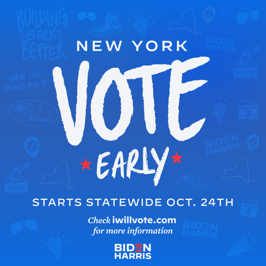
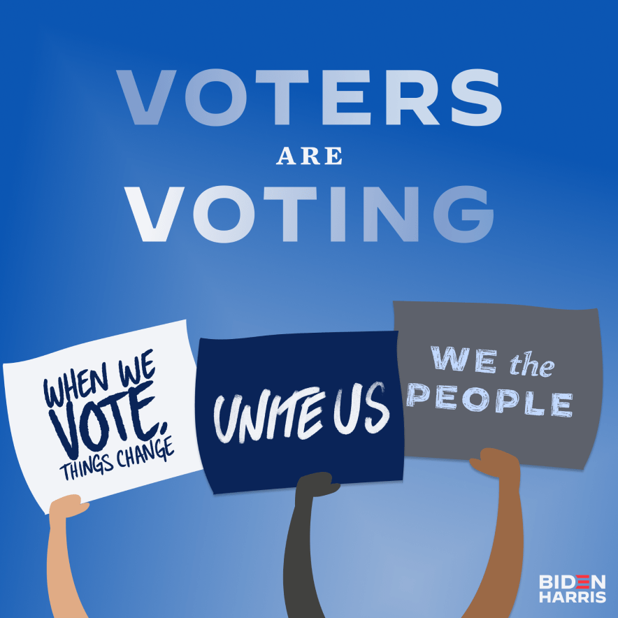
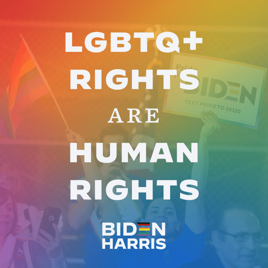
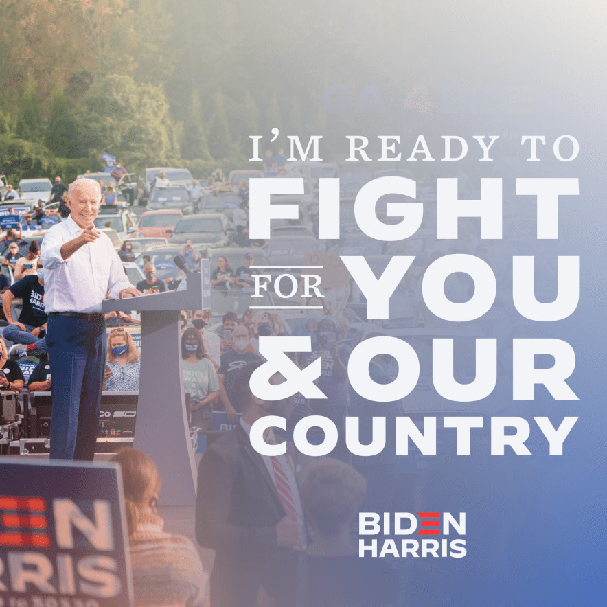
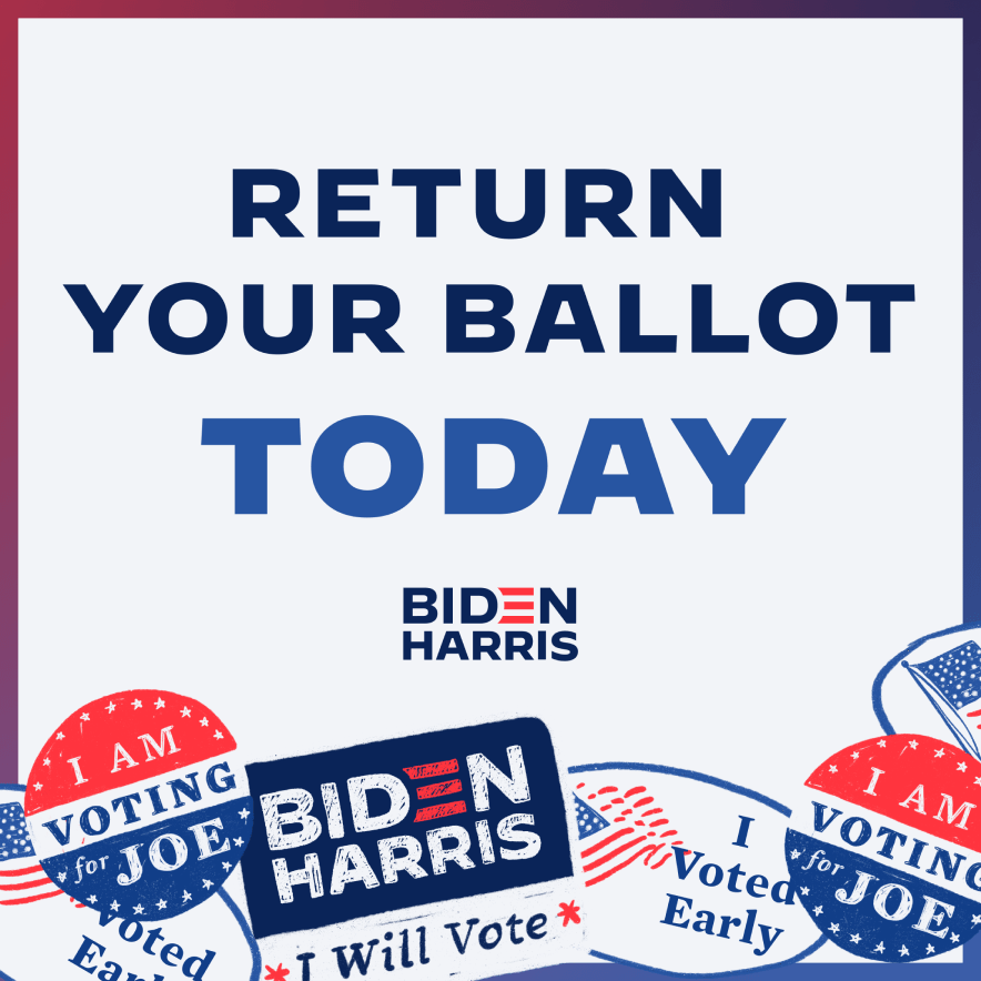
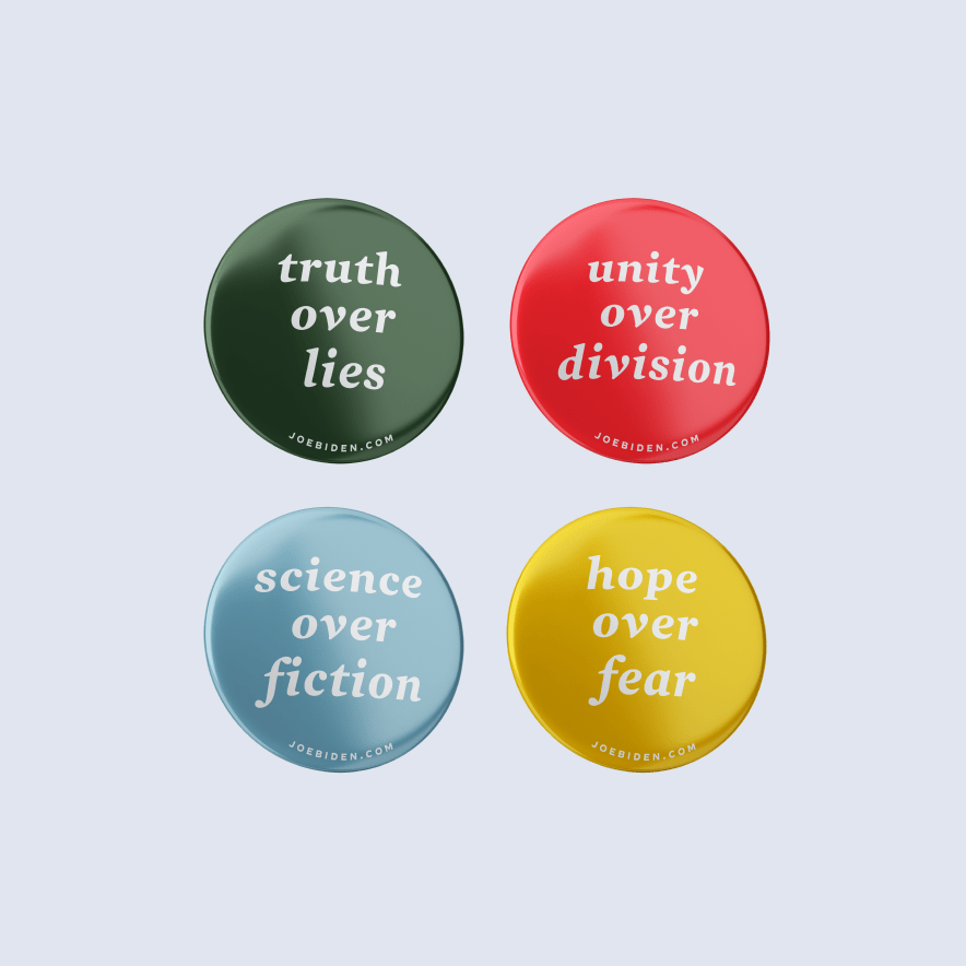
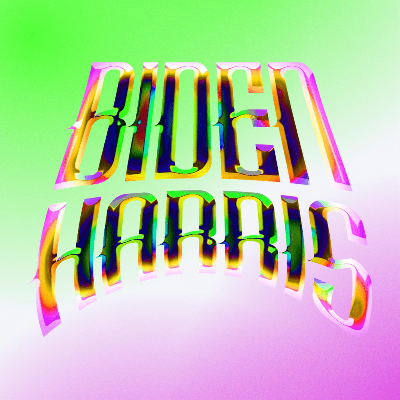
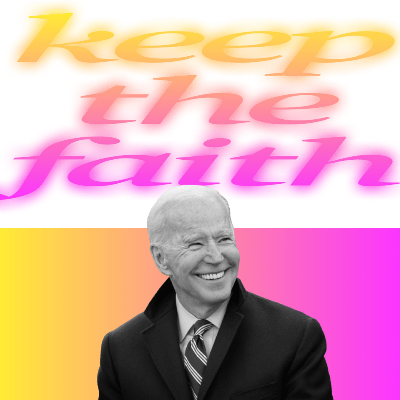
Since this was no ordinary campaign, we needed to go above and beyond the norm, incorporating a variety of pop culture references, neon gradients, and unconventional type treatments throughout the campaign imagery to energize first-time voters. It was a choice that led to widespread attention and praise.
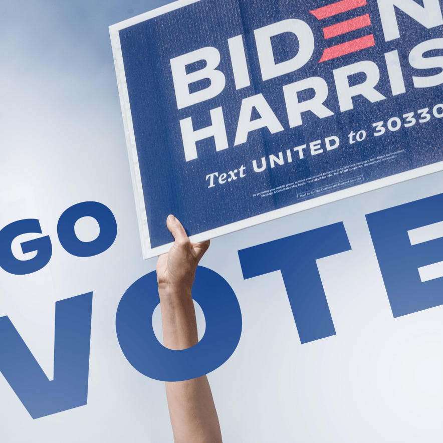
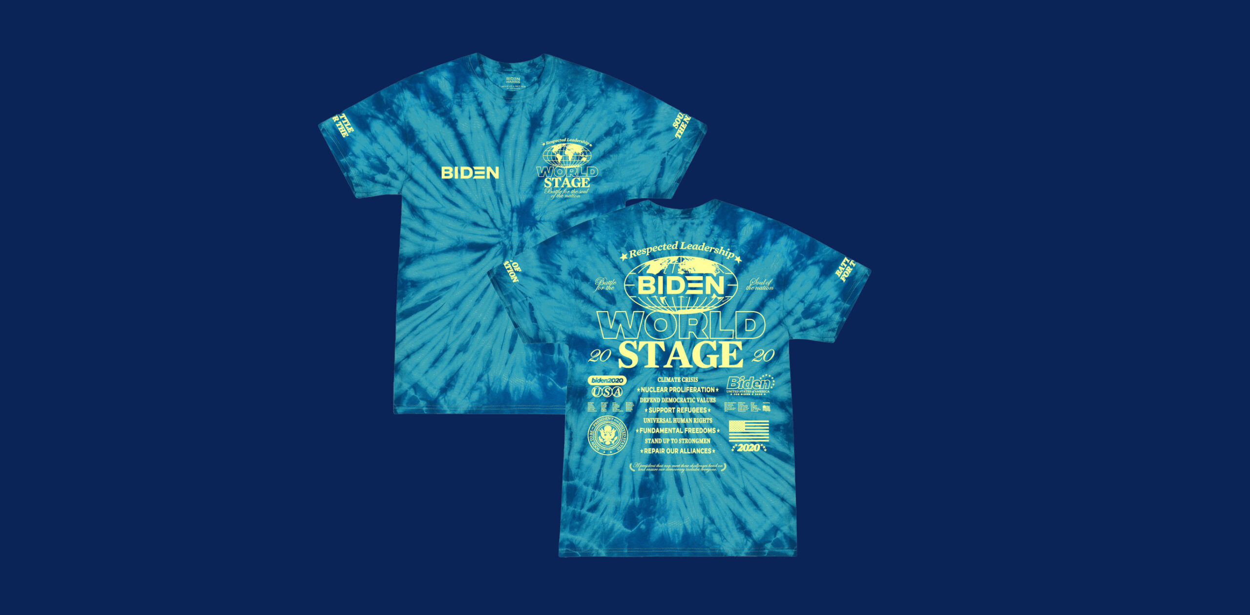
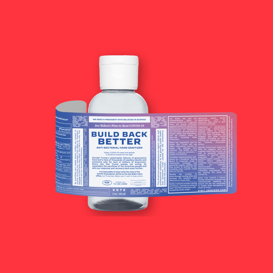
We knew that our t-shirts and yard signs also needed to be extraordinary, so we partnered with Vogue’s First Lady, Anna Wintour, as well as 19 top designers, including Thakoon and Joe Perez, for our Believe in Better label. We also created merch that tapped into hot cultural moments, with items like our sold-out Truth Over Flies swatter that stemmed from the now-famous fly that landed on Mike Pence’s head during the vice presidential debate. This merch was so popular that it fundraised nearly $40 million in the last 4 months of the campaign alone.
Speaking of fundraising, in collaboration with our talented in-house tech team, we redesigned JoeBiden.com to simplify the donation process, which led to Biden raising more money online than any other campaign in history. We also included a step-by-style digital organizing tool that made it easy for supporters to take action and get involved.
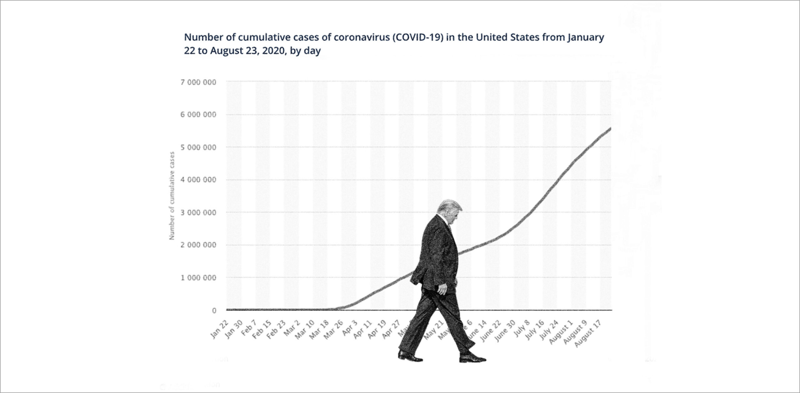
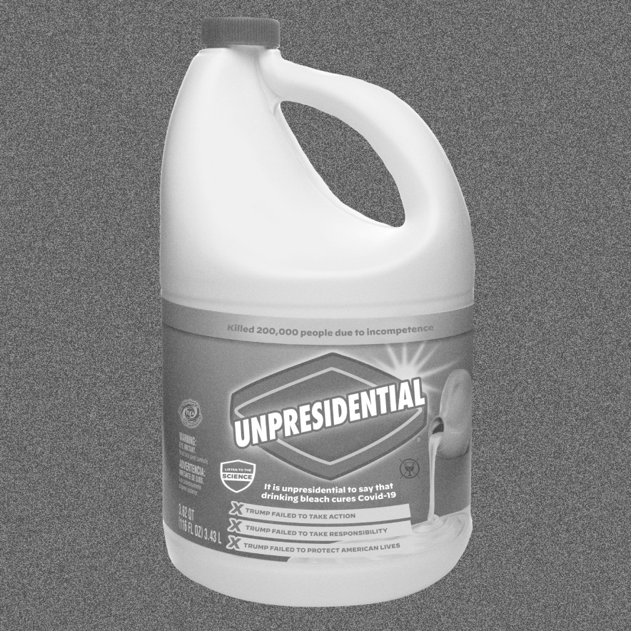
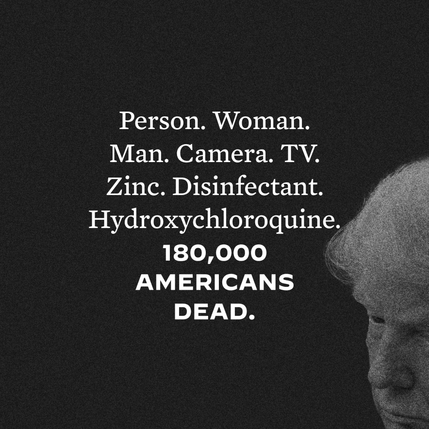
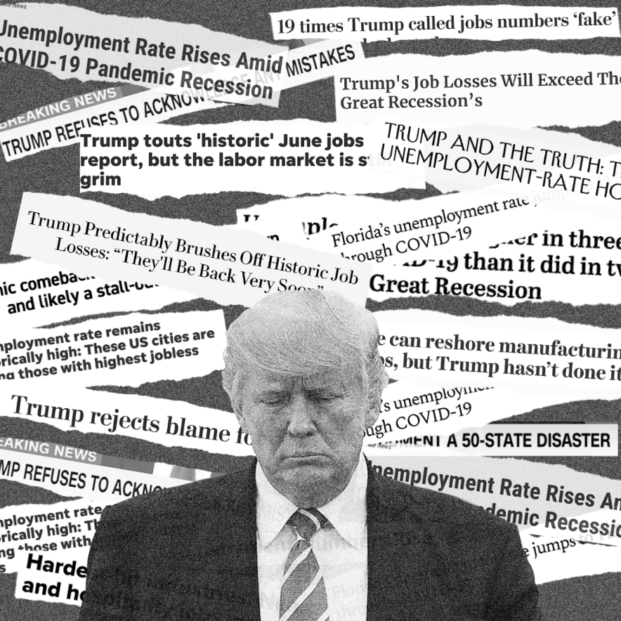
Given that Biden’s opponent basically ran on aggression, we didn’t want to take the traditional design approach to the opposition, which commonly paints opponents in an aggressive angry light using high contrast, zoomed-in photographs. Instead, we wanted the opposition to feel dull and morose, using flat, grainy images that deflated his power.
This direction, which came out of conversations with Sam Esmail and his work on Mr. Robot, has since become the norm for many Democrats. Read more here.
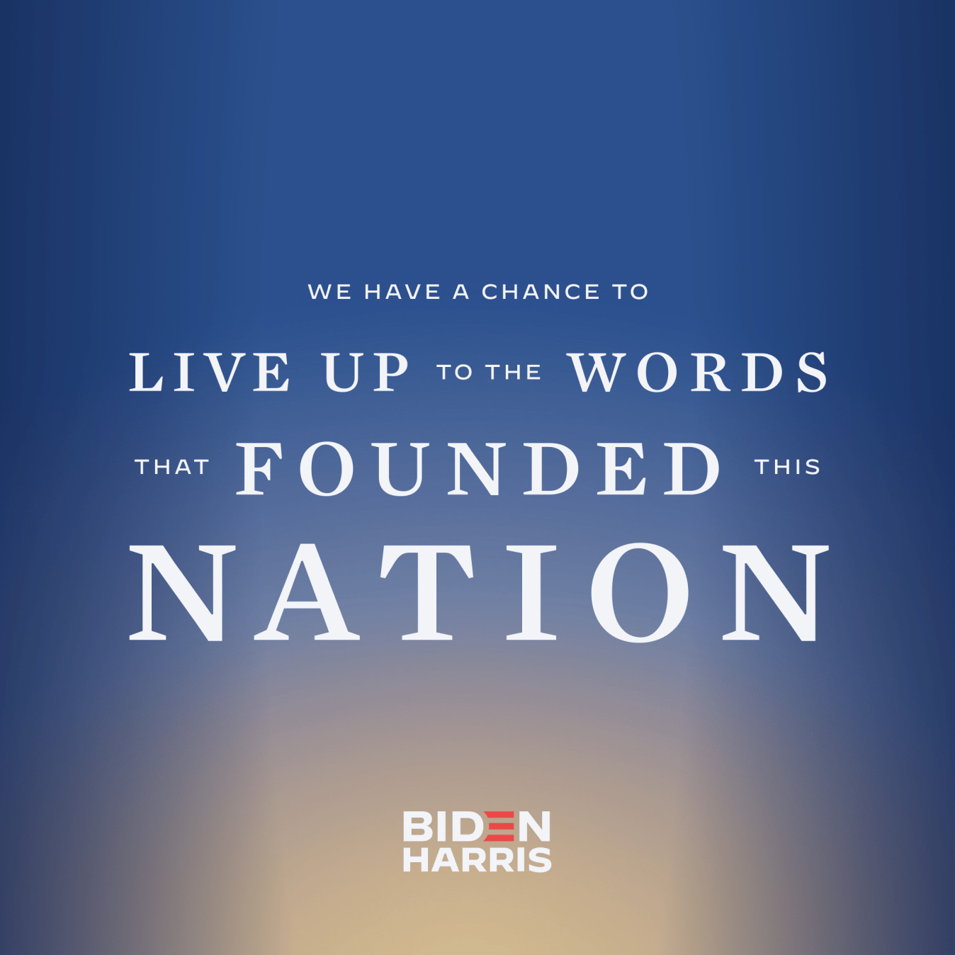
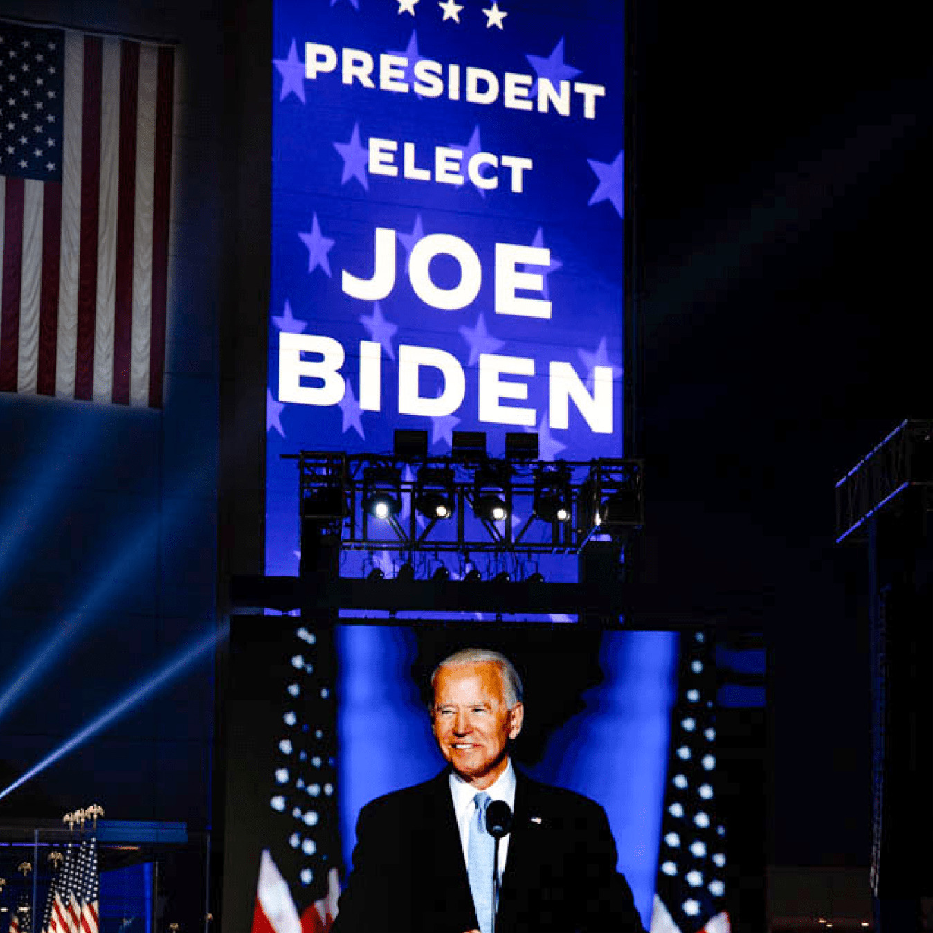
Election night represented the dawn of a new day in America. To illuminate that concept, our creative echoed an actual sunrise. Working with the Advance team, we began the event with a deep blue gradient that resembled the night sky, and as the votes were counted, the gradient started to rise. On November 7th, when the dust finally settled, we revealed the Victory Gradient in its final form: a bright, full sunrise, representative of a new era before us.
Studio Team:
Robyn Kanner, Aja Nuzzi, Eric Ziminsky, and
Anna Impson

