Shapiro for Governor
Brand Positioning
Creative Direction
UI/UX
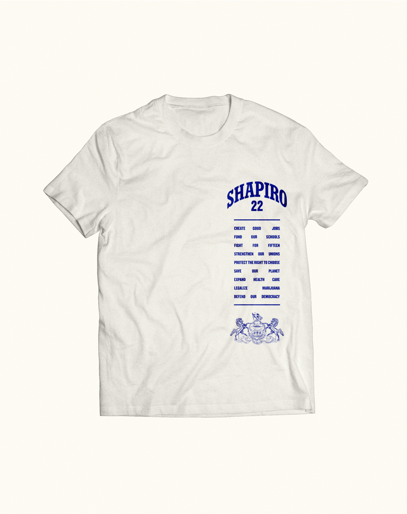
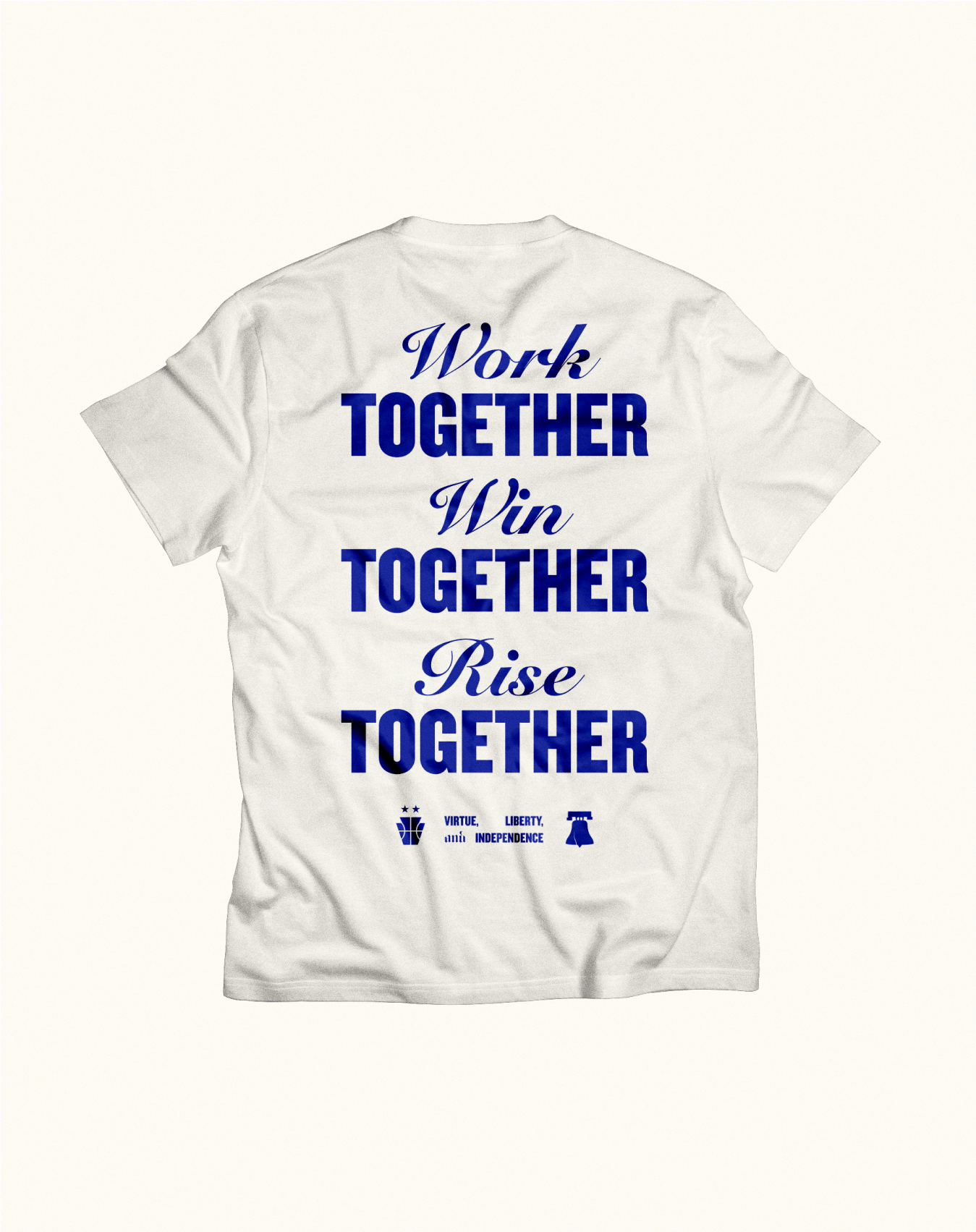
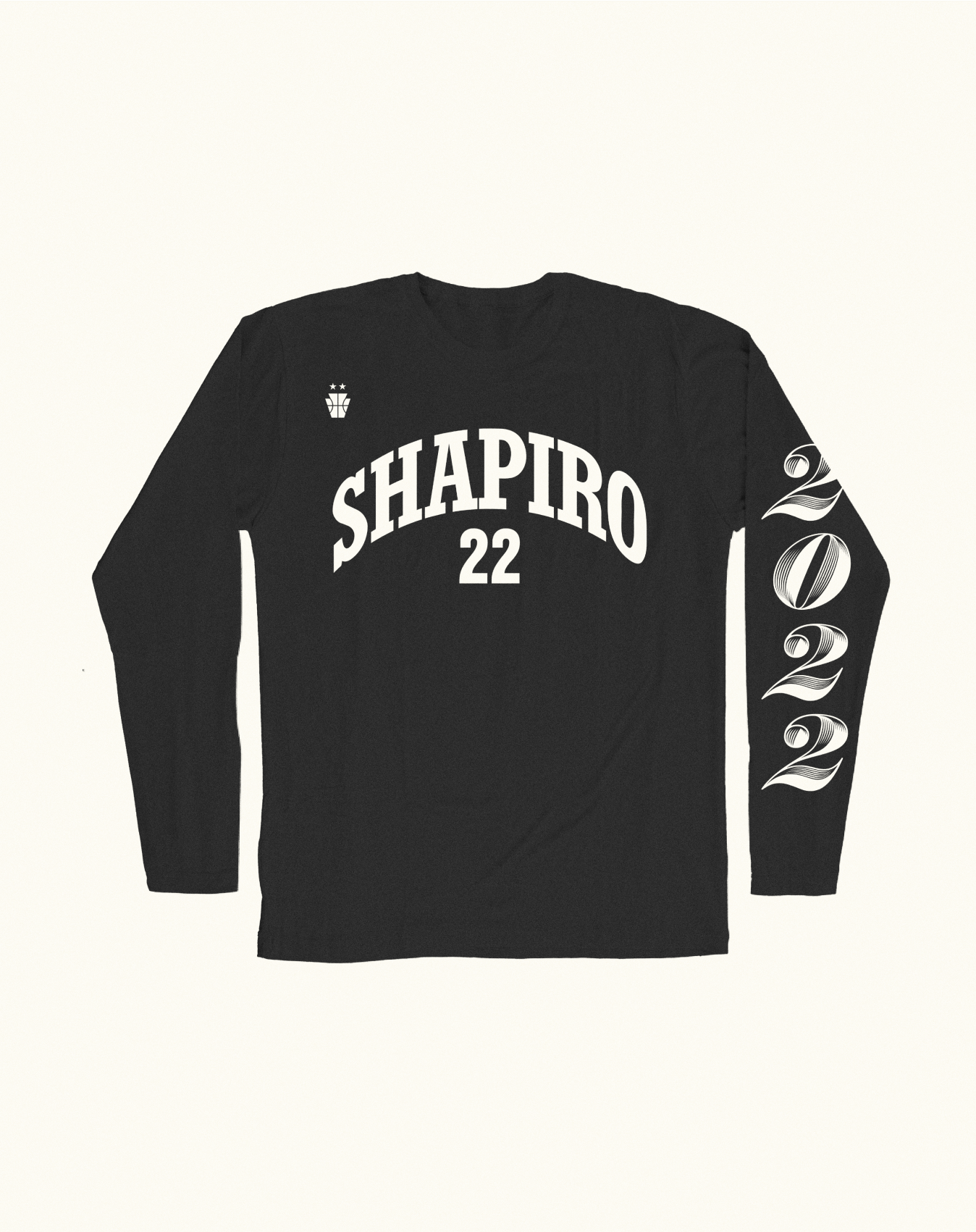
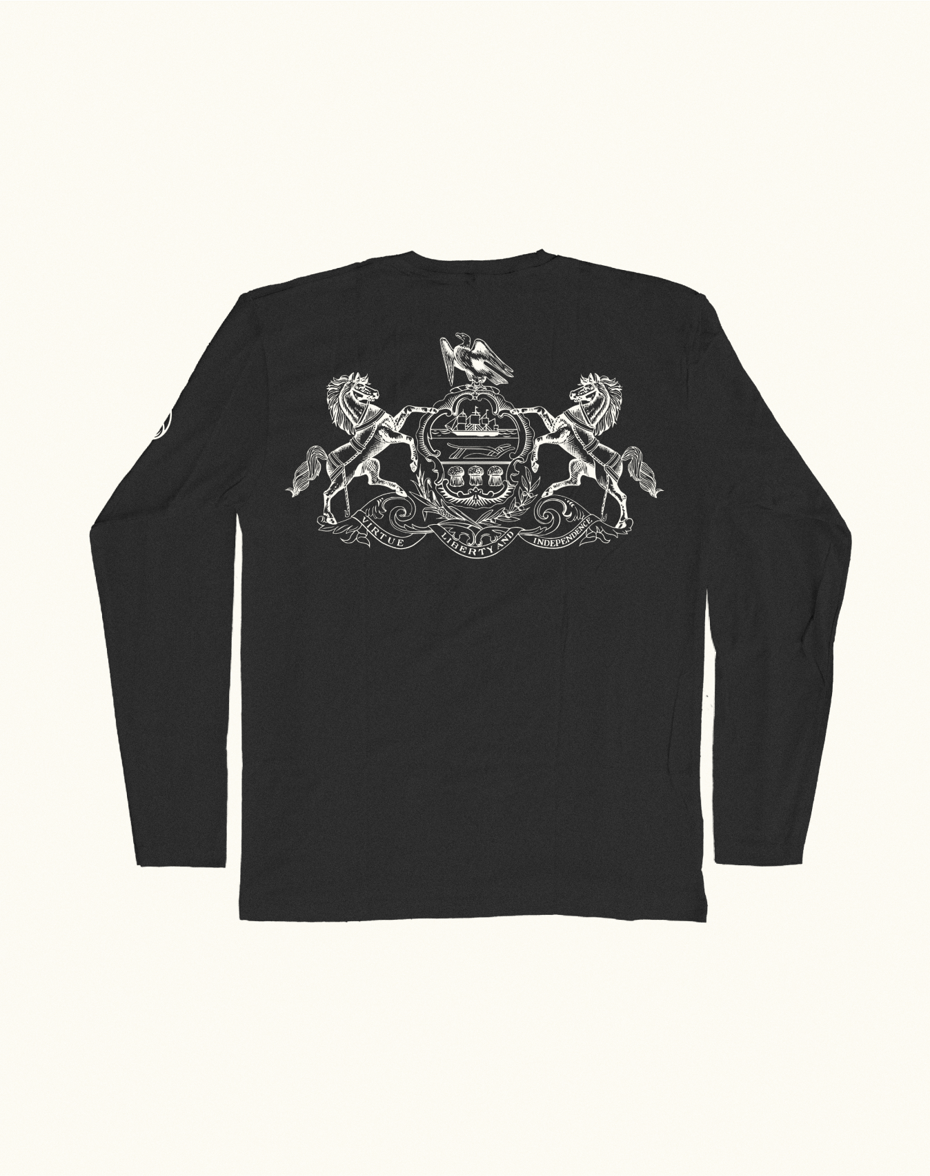
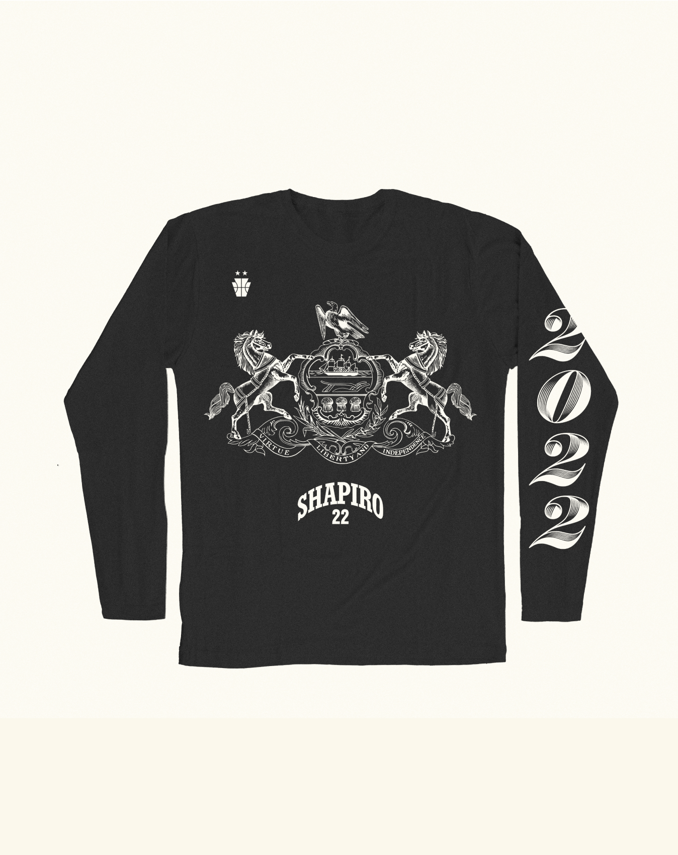
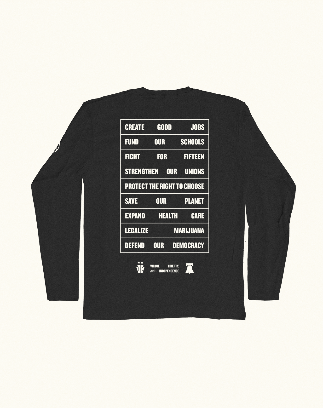
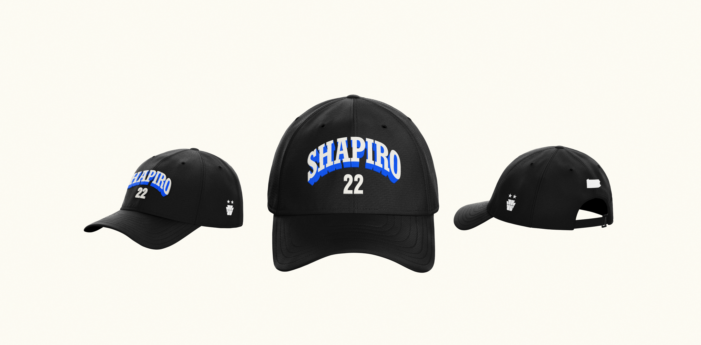
Merchandise Design
joshshapiro.org
shapiroinauguration.org
shapirobudget.pa.gov
Our first meeting with Josh Shapiro looked a little different than other brand conversations we’ve had with politicians—because we didn’t chat politics; we talked basketball. When Josh spotted a Kobe Bryant poster in our Creative Director Robyn Kanner’s office, he immediately lit up, telling her all about how he used to play with Kobe
in high school.
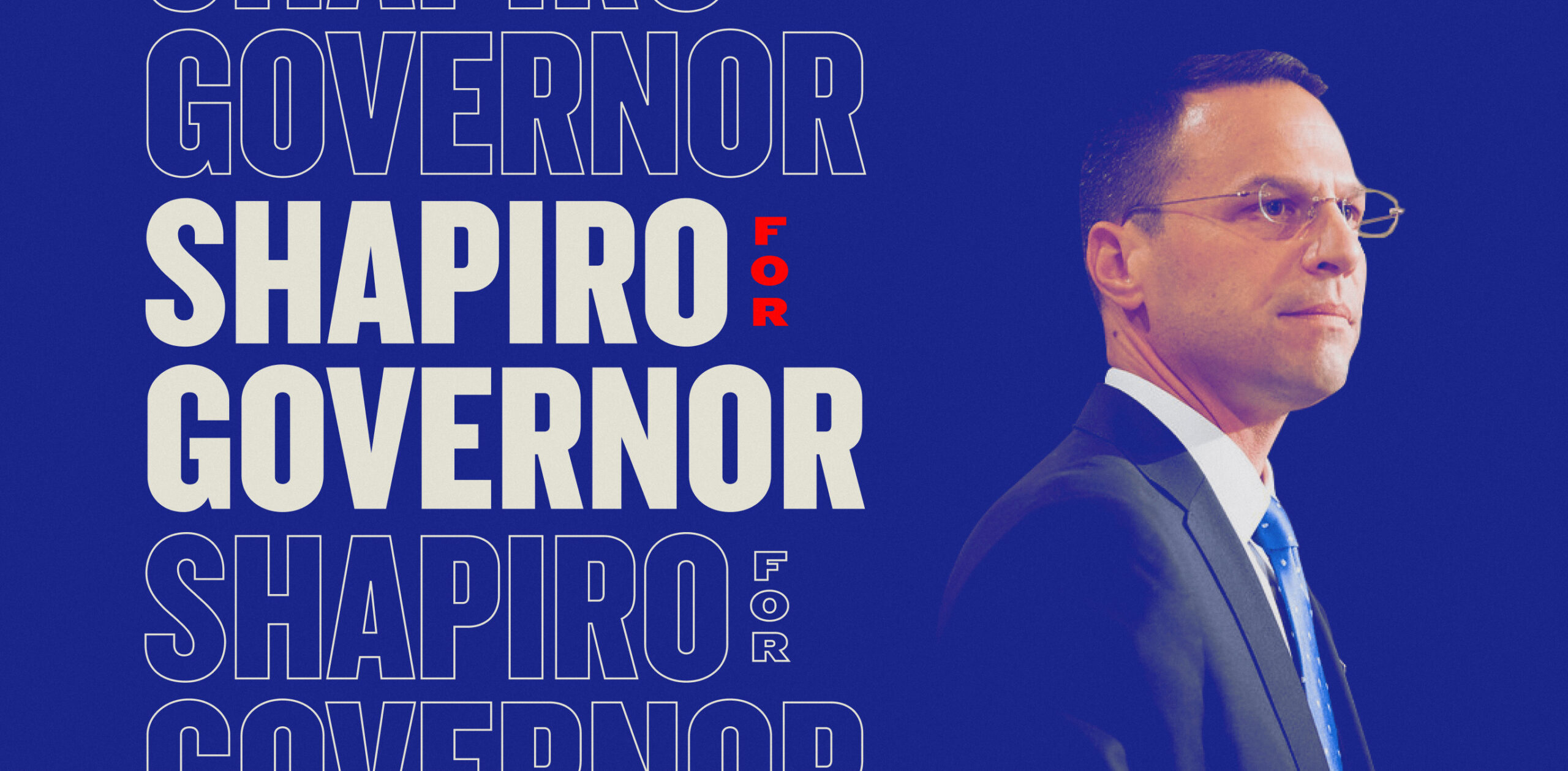
This conversation ended up shaping the entire brand because as it turns out, there are key similarities between sports and politics. To get things done in both arenas, you have to get in the game and work together to beat your opponent. But one thing that sports has in spades but politicians often lack is a coolness factor.
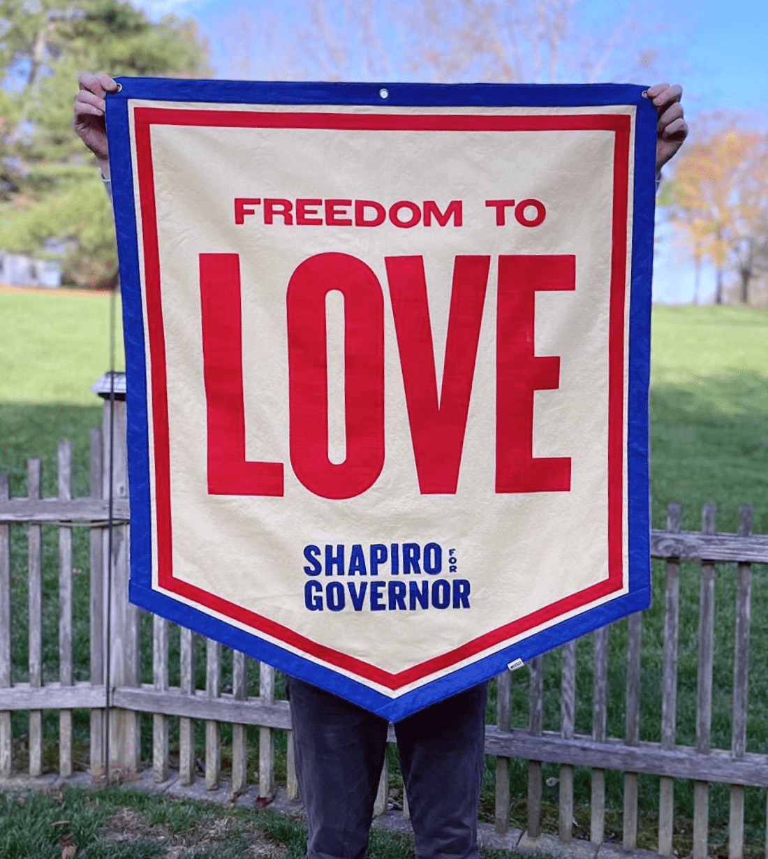
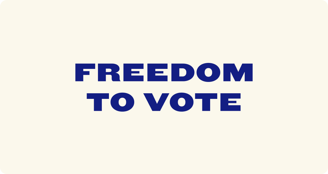
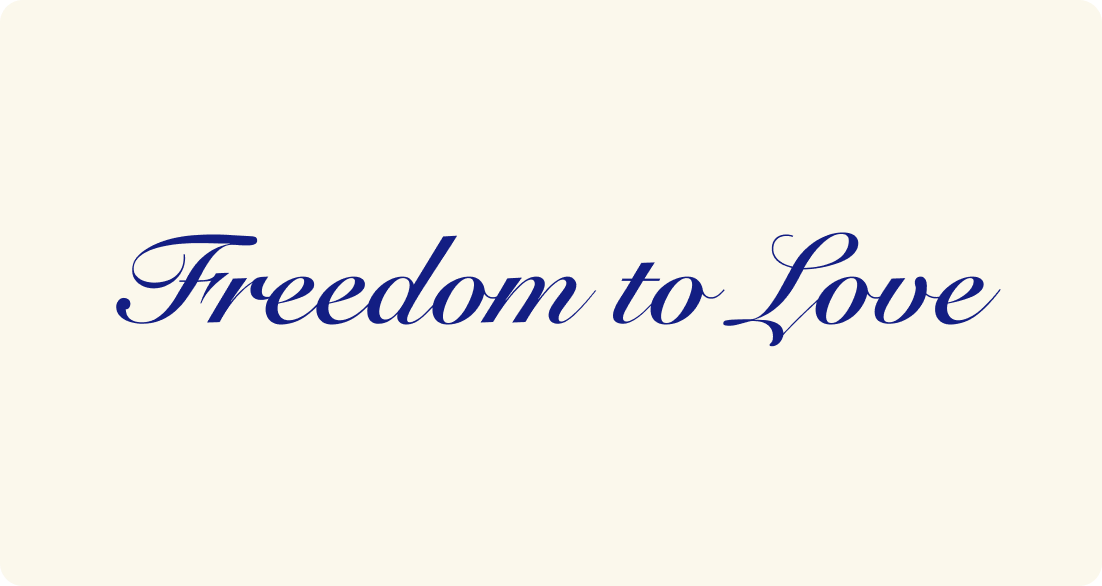
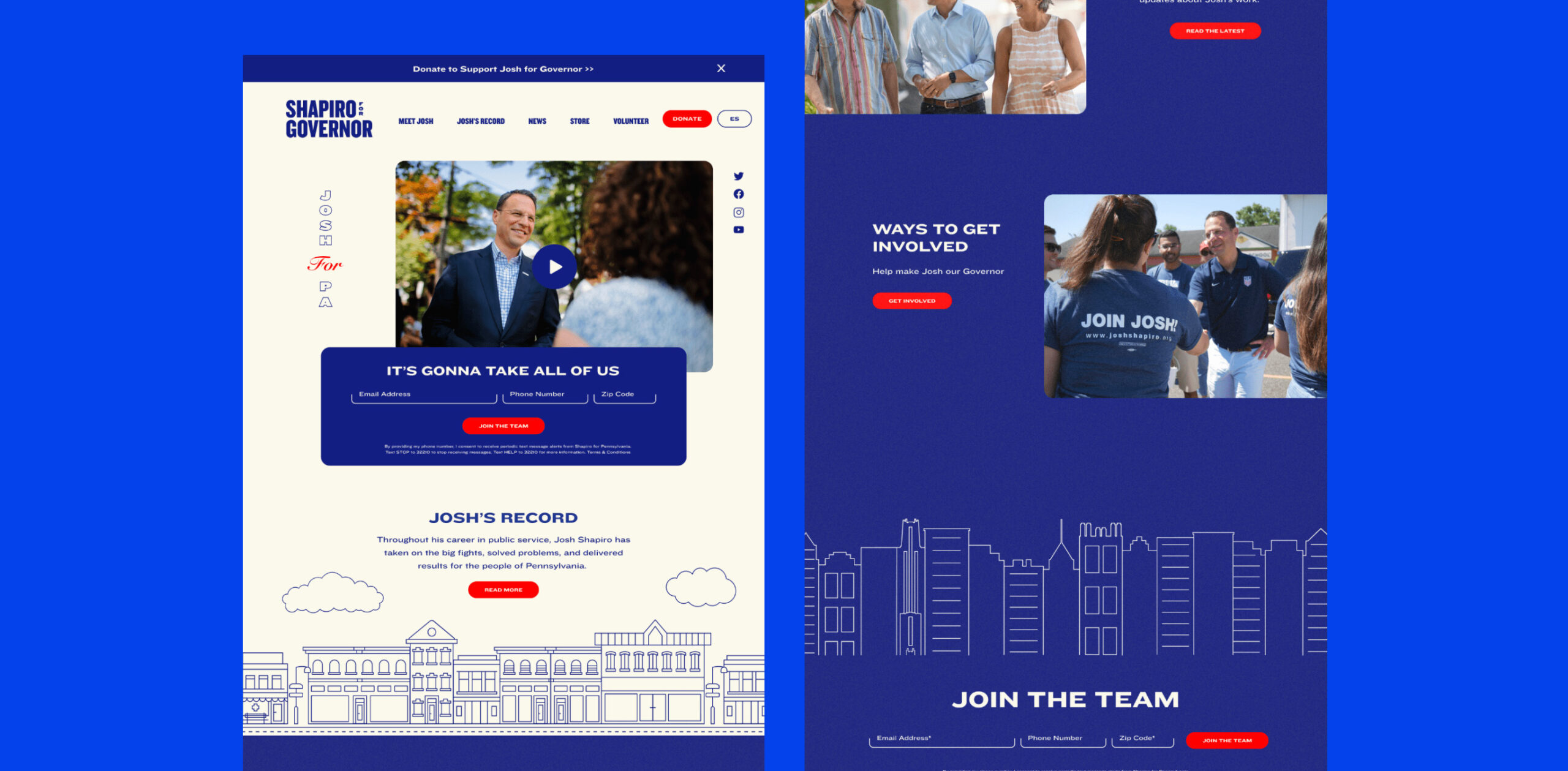
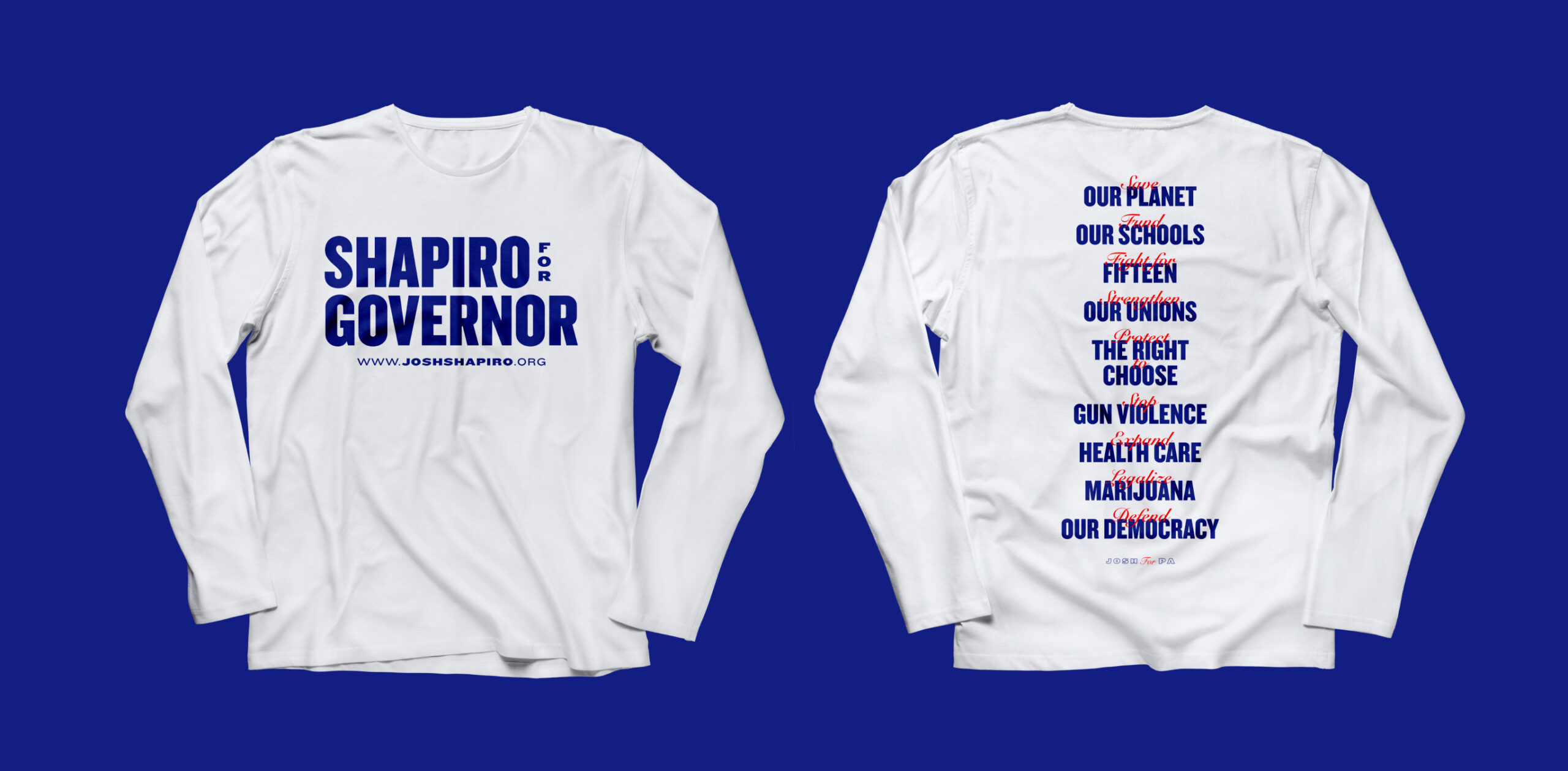
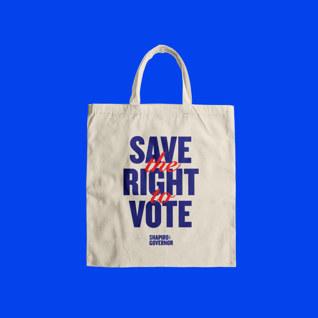
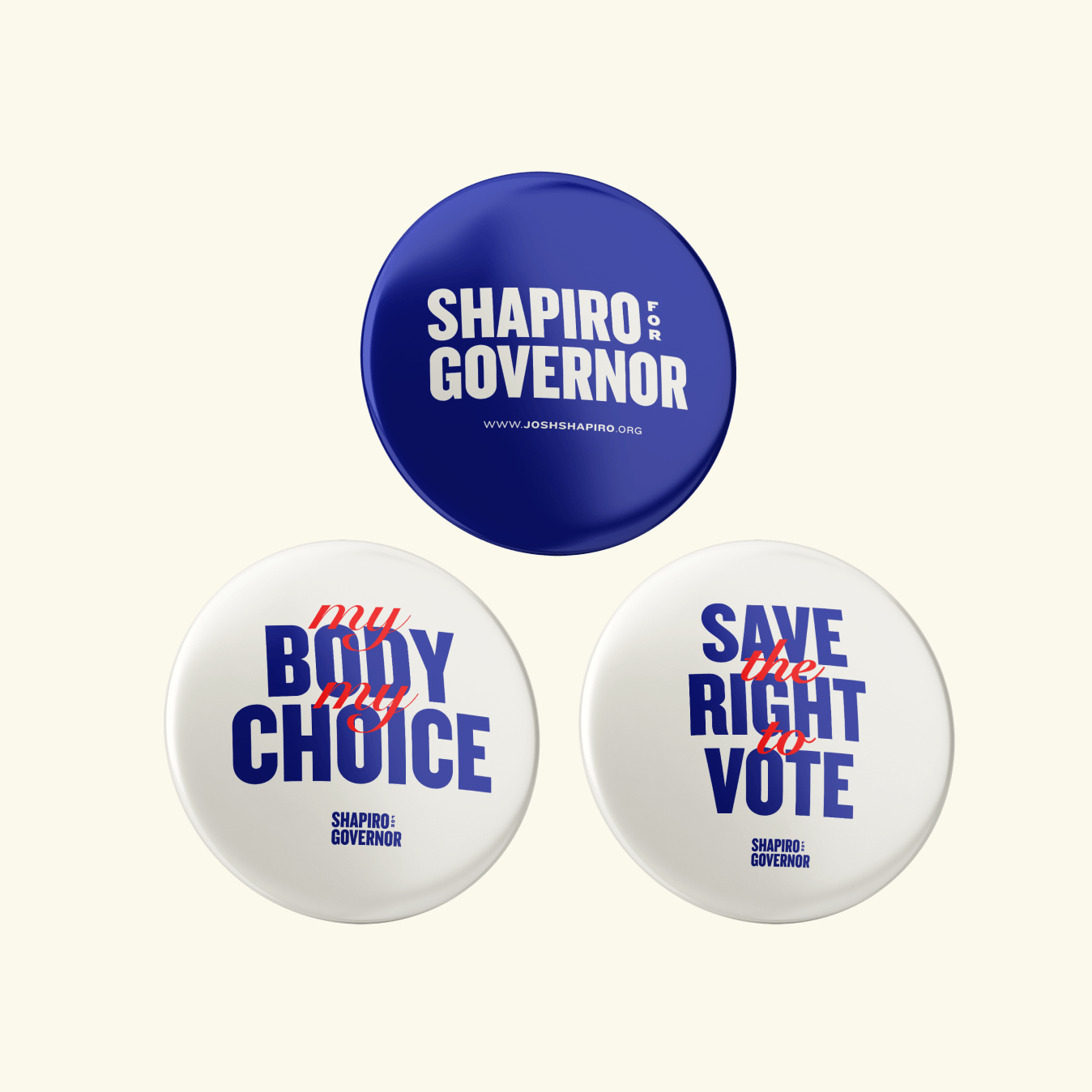
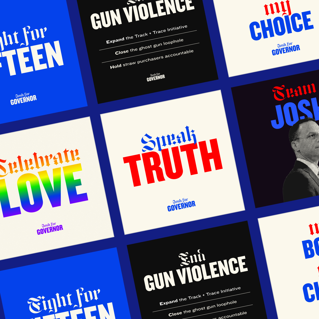
Sitting within this refresh is an updated color pallete that stretches beyond red, white, and blue — introducing natural tones of yellow, green, red, and purple to reflect the exuberant energy of the party. Alongside these color updates are two new typefaces: ITC Cheltenham and Trade Gothic. These fonts allow this refresh to feel both friendly and stoic, meeting the moment of our politics.
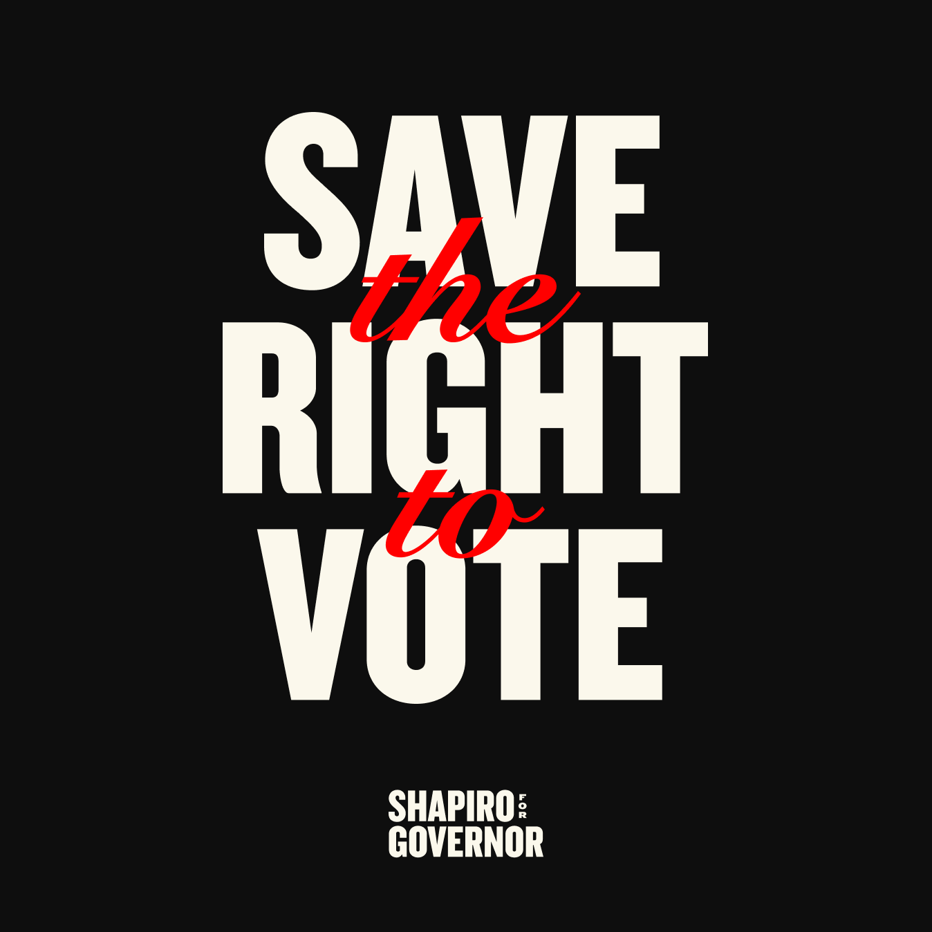
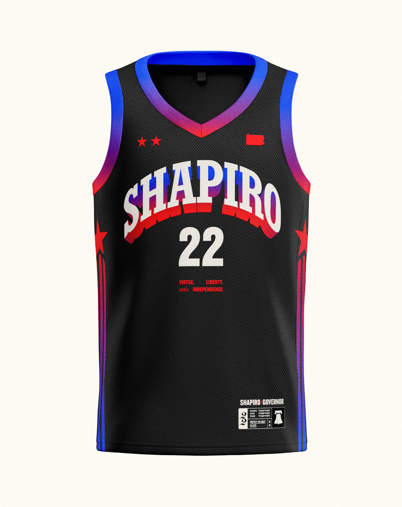
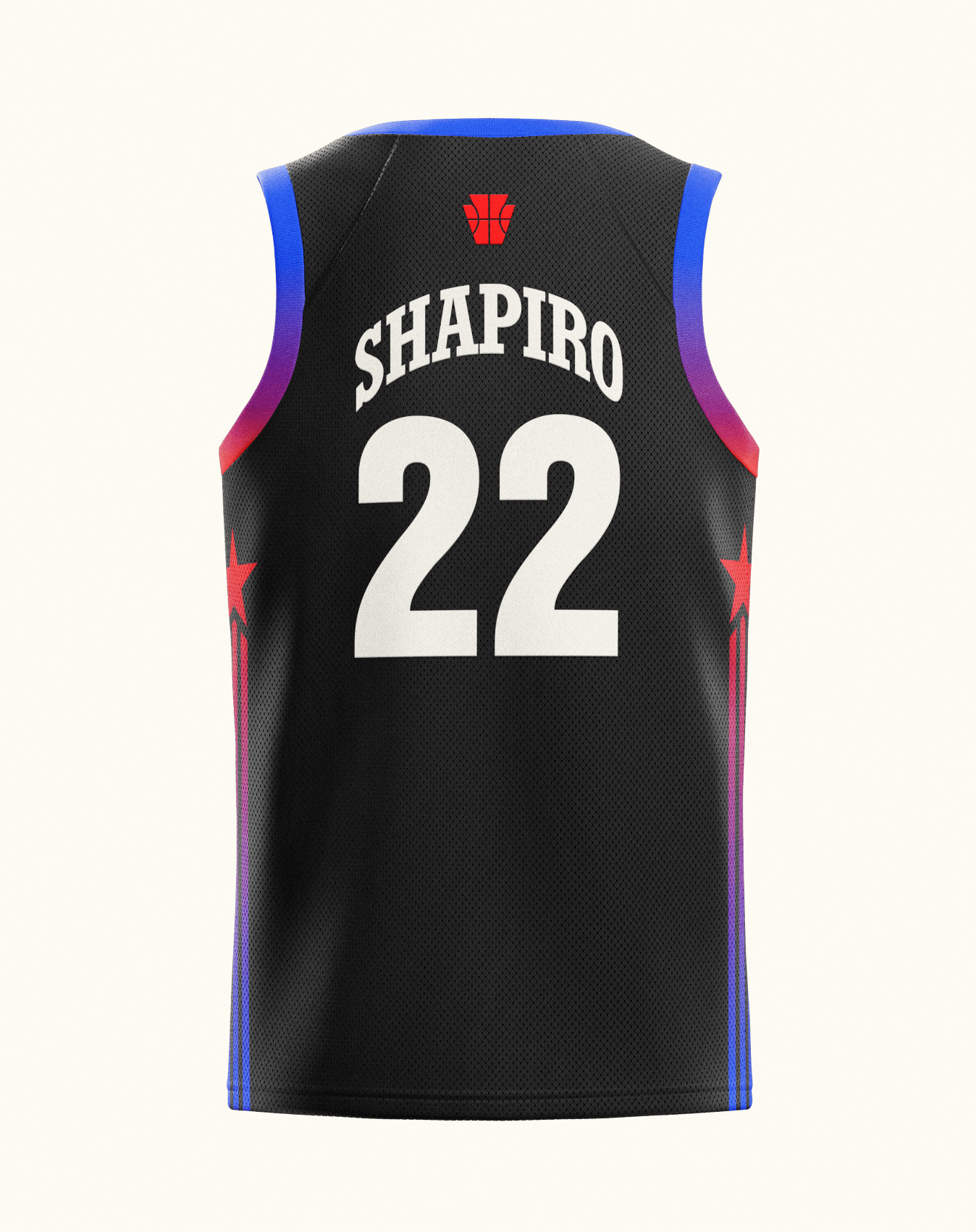
We knew that a progressive candidate like Josh needed to amplify the innate cool we identified during our first call—that bit of joie de vivre that makes young people stop scrolling, start listening, and ultimately get behind a candidate. So we took inspiration from NBA coaches, creating branding that helped Josh embody that relatable but authoritative head coach energy.
Studio Team:
Robyn Kanner, Deanna Marie-Norcross, Aja Nuzzi, Cesar Hernandez, Eric Ziminsky, and Anna Impson

